Viral Man: The Making Of – Part 5

In the last entry, I wrote about how we had developed the campaign to the point where we were now in the studio, taking photos in preparation for the poster campaign. Unfortunately, having looked at them over the following weekend, I decided that they weren’t good enough to use and so on the following Monday, we went back to the studio.
Photoshoot Number 2
On our first trip to the studio, we had to set up ourselves and as I’ve already written, I’m not a photographer. We struggled along and did take some shots that were adequate, but none that stood out. Luckily on the second visit, we managed to find Mike Pumford, Kingsway’s technician who generously took a moment of his time to help us out and set the equipment up correctly and we started taking much better shots.
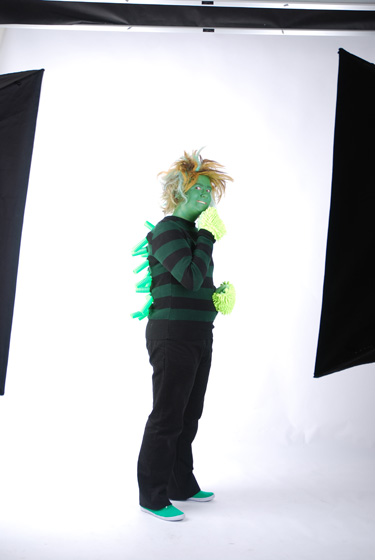
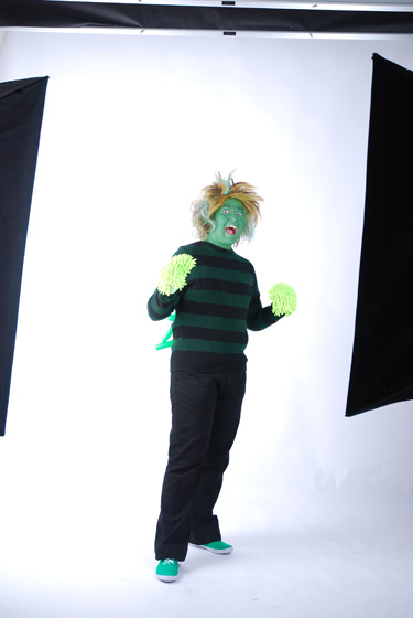
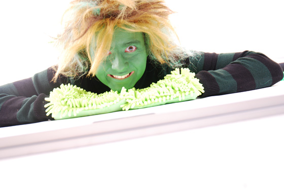
As you can see, these images proved to be much more professional, even at an unedited stage. We ended up taking a lot of photos. Some good, some bad. But there were quite a number of them that stood out.
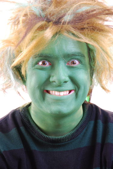
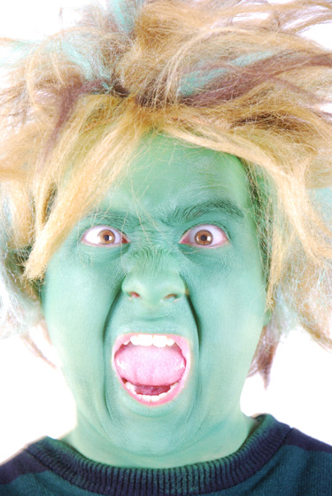
In order to get people to pay attention to the posters, I felt that some tight closeups of his face were important. His costume was secondary. His green, over-exaggerated face was what would attract people to look at and read the posters.
Making Viral Man larger than life
The next day, I began sifting through all of the photos we had taken. With three photos picked out, I set to work on making him larger than life. It was important that the character only resembled a normal person, rather than simply looking like a person with green facepaint. So, in order to do this, I started exaggerating his eyes to the point where there was no doubt that these eyes could never belong to a normal human being.
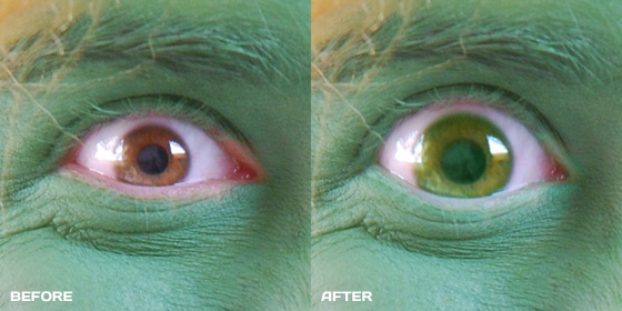
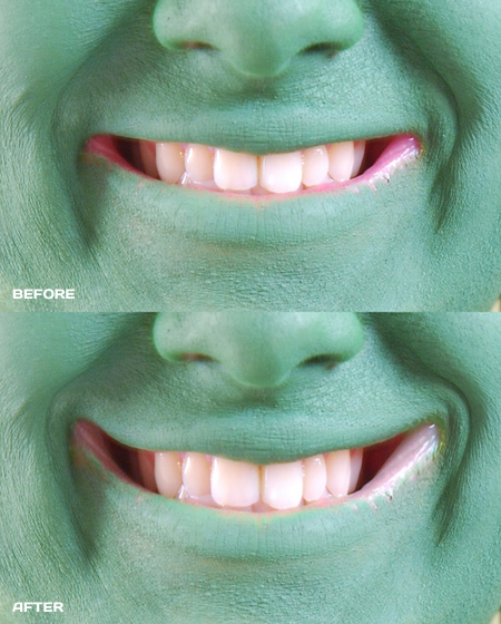
I started by performing a digital makeup check on the eyes, improving the coverage of the facepaint on the eyelids to the point where they looked much more naturally blended. Also, I have brown eyes and they looked out of place on such a green character so I changed the colour of them. Finally, I exaggerated the entire area of the eye to much larger proportions. Of course, the beauty of Photoshop is that you can do these modifications seamlessly and it did the trick. I also increased the size of the character’s nose and mouth, and did the same makeup checks on the lips, while digitally pulling the sides of the mouth up a little to make it look as if the character was grinning more than humanly possible.
The Logo
As I showed in an earlier entry, I wanted the character to have a logo of some sort. Something that would tie all of the various elements of the campaign together and I knew roughly what it should look like:
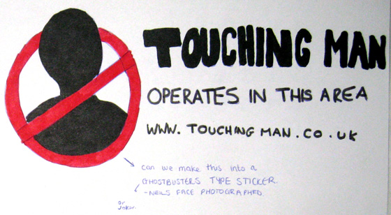
Now that we had taken lots of photos, I had something to reference. It was important that it wasn’t just a generic silhouette like in my above sketch but adequately referenced the character. And of course the thing that stands out most about the character besides the fact that he’s green, is his hair. And so this is what I came up with:
 You’ll notice that it says Viral Man, not Touching Man, as I’ve been referring to throughout these entries. And I’ll get onto that in a moment.
After designing the logo and writing the copy for the posters, I was very happy with how they looked. And here they are:
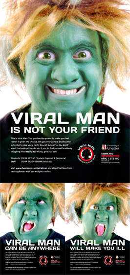
You can view larger versions in the project area, which will be going live within a week of this post.
The presentation
After four weeks of working on this project, surprisingly, we had still yet to actually show anything to the committee responsible for giving it the green light. We had wanted to keep it secret until a point at which we could properly present it i.e. The above posters and photoshoots.
On Wednesday, I spent the day designing a screen-based presentation which I was to deliver the next morning to introduce the committee to what we had so far. I travelled to Chester for an 8am start and set the presentation up in the meeting room. At 8:30am, everyone arrived and the reveal took place. I had designed the presentation to slowly describe why the character looked the way he looked by cropping various photos of him, starting at his green shoes and working all the way up to his face. At the final reveal of his face, everyone seemed to like it.
In addition to the reveal Touching Man’s face, I had also been practicing my voice for the character and recorded a basic example script so that the committee could get an understanding of how he would sound in videos. Have a listen.
Unfortunately, there were concerns about the voice sounding too much like a speech difficulty and because it was a university-produced campaign, they didn’t want to offend anyone. This was understandable and the voice was scrapped for something more recognisable and normal.
Overall however, everyone was really pleased with how the campaign had been developed so far and were looking forward to seeing the finalised videos.
One of the things that came up in the meeting was the creation of the website. I hadn’t been looking forward to designing the site as there wasn’t much time to do create it and a Flash website takes time. Luckily however, the c0mmittee expressed their interest in using social networking instead of a website because they were worried about maintaining the site. It meant that we could focus on building the Facebook profile and more time to film the videos.
One final thing that the committee asked for was a second poster campaign that ran with the government’s national campaign’s slogan of “Catch it, Kill it, Bin it”. This meant another trip to the studio on the same day, where Hannah and I spent the afternoon taking more photos.
Photoshoot number 3
Just before we went to the studio, we spent an hour looking for props to use in the three new posters, showing how the character could be caught, killed and binned. That meant buying a net, anti-bacterial gel and a large bin. Quite a strange shopping list.
The photoshoots are fun, but quite tiring. It’s much more than a case of just taking three photos and that’s it. It’s getting the right photo, with the right focus, lighting etc. And this takes a hell of a long time to do. We spent a long time getting shots to look right.
A friend came to help/watch us take more photos in the studio and literally provided a helping hand to hold some anti-bacterial gel to look as if he was killing me with it. I also took some shots of his arm on its own so that I could play around with it in Photoshop and add it to a photo of myself.
At the end of the day, we came away with nearly 300 photos. That night I started to develop the photos into posters.
The name change
The next day, I recieved a priority email alerting us to the fact that the committee had changed their mind about the name “Touching Man” as they felt it had too many negative connotations, especially for a university-led campaign. Instead, they asked if they could use “Viral Man”. This change came after I had already designed the posters, logo and set up the Facebook profile. Admittedly, the four of us responsible for running with the name (And telling the committee about it at an early stage) weren’t happy with the name change and I tried my best to persuade them to keep “Touching Man”. It wasn’t to be though and “Viral Man” was chosen as the new name.
In retrospect, it’s completely understandable. I think that because we had been working on it on our own for four weeks, we had become quite accustomed to the name, regardless of if it was suitable enough for the project. While “Viral Man” is a little more tame and obvious, “Touching Man” does indeed bring too many negative connotations and the name change was justified. And so Viral Man was born.
I made the required changes to the posters and logo and set up another Facebook profile, this time in the name of Viral Man. Luckily, the 2,500 stickers which had been designed for the campaign had not been printed yet and they needed to be changed to reflect the change of Facebook profile address.
And so the penultimate week was over and there were now two poster campaigns, a Facebook profile, stickers, a logo and a countless number of photos that had been taken over the course of three photoshoots. Next week would be all about filming and finally, signing, sealing and delivering the whole campaign to the university in preparation for its launch just a few weeks later.
In the final entry: Two days of filming, an interview with Viral Man and taking delivery of 2,500 spikey balls.
