The cost of design

I’ve always found it interesting the way that many people – even small business owners – cannot quite quantify the cost of things that aren’t tangible. For example, if it’s a TV on sale, the price is final and you either buy it or don’t. If it’s a car, you may be able to haggle a little, but still understand you’ll be paying a similar sum to that shown. However, when it comes to design, those rules never quite seem to apply. This post seeks to discover why that is and garner a few responses in the comments from fellow designers but perhaps more importantly, from those who aren’t designers. I’d value your opinions.

As someone who always tries to be professional but down to earth and approachable in my work, it does still surprise me when people are taken back by the cost of design, whether that’s a logo, website or maybe just a flyer. Perhaps the most ironic thing is that my rates are lower than many other designers that offer a lower quality service at a higher cost. With that in mind, the question must be asked: Do clients always go with the cheapest option without regard for quality and service? If yes, are they satisfied with what they get for their money and if they are, is it simply because they didn’t see what they could have gotten by spending a little more with someone else?

The clients that I’ve worked with have all understood that the cost of design is recouped in the extra profit gained through good communication with their customers. Unfortunately, many small businesses see the cost as something that will never be reclaimed and is merely an unnecessary expense and so either choose to go with someone who will do anything they’ve asked for for a very low cost and therefore low quality or, in many situations just simply not bother and continue communicating to their customers through the use of bad design if any design at all.

I believe that a lot of small businesses don’t associate the cost of design with the amount of hours put into it but rather, associate the cost with the final item. Many businesses don’t see the amount of time that goes into emailing, sketching, mocking up, variations and finessing, but rather, just see that one, final logo or flyer that may well have taken you 20 minutes to design, but 20 hours to get to that stage. That’s where most of the cost of design comes into play – the time spent working on your project, not the time spent on the final deliverable.

It is perhaps a little saddening that many small businesses feel this way about improving their image with its customers because there are many out there who could use that improvement and would see a return on their investment in a designer through bigger profits. And that’s exactly what working with a designer is – an investment. An investment does not give immediate returns, but rather, grows over the course of weeks or months, recouping your initial payment plus profit. If more businesses saw working with designers like this, I believe that some fantastic things could happen.

As I said in my opening, I would value the opinions of anyone who owns a small business and has always been afraid of working with a designer. Is it the cost that puts you off? Do you feel as if you don’t have enough of an understanding of what it is you want? Or perhaps you have worked with a designer and it hasn’t been a pleasant experience. Whatever it is, I would love to hear your thoughts.

New projects coming soon

cover

You’ll have to forgive me for not updating more often recently but University is coming to a close. I’m working as much as I can on getting my projects up to scratch and submitting them for the deadline of 12th May. It’s an incredibly nervous and stressful time for everyone who is in the same position as I am.

I’m looking forward to being able to use these entries as a way to offer insight into how I’ve been working on my projects, offering screenshots and rough sketches. I really believe that seeing this kind of thing helps other designers. For example, David Airey always offers great insight into how he works through his work, offering glimpses into his paper-based work and digital variations. I’d like to go one step further than that, though and provide a more detailed analysis of one or two projects, showing exactly how I’ve arrived at the final piece of work.

I’d like to do this for two reasons. Firstly, because from one designer to another, I always think it’s interesting to see how someone works but perhaps moreso, from a non-designer’s point of view, I think that the world of graphic design can sometimes be a ‘private club’. A profession with a very unusual and hard to break into language. Since graphic designer’s clients are usually not design-orientated, it is of course important to make design as accessible as possible to them and I hope that through offering a walkthrough of my work, I’ll help people understand how I work.

I’m also looking forward to uploading new projects, including some unexpected charity work that I’ve recently completed for Chester Charity Beer Festival. The festival begins 14th May and lasts until 16th. Last year, the festival managed to raise £7,000 for charity and I’m hoping that this year they might raise even more than that. I’m waiting until the festival is over to upload the project because I intend to take some photos of the work that will be on display at the festival. Stay tuned for that.

In the meantime, please do get in touch if you’d like to discuss working together. I’d love to hear from you.

Bad business, good business

Unfortunately, though I thought I’d have my new site up by now, there’s been a bit of trouble with the back end. Hopefully it won’t be too much longer before I can finally get it up and running.

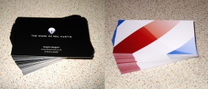
One of the main reasons that I’m so eager to launch it is because of the increasing priority to simply get my name out there. I graduate University in May and long before then, I’d like to have a few freelance projects under my belt and the only way to do that is to promote the hell out of myself. I’ve already begun taking smaller steps than the relaunch of my site. This includes fantastic new business cards, which I very much love.

New business cards
New business cards

Via the purchase of Michael Bierut’s 79 Short Essays on Design on Amazon, I recieved a flyer offering me 250 business cards from VistaPrint at what I thought was a rather good price. I had been looking for some new business cards for quite some time, after using very unprofessional ones that I had printed myself.

So, I fired up Illustrator and designed my card, with the dimensions of 85x54mm, which is a standard dimension for a business card (Same size as a credit card, for those that don’t know) and uploaded it to VistaPrint. Confirmed all of the options and paid my £19 or so. I was told I’d have them within two weeks. Not bad. Or so I thought.

When they came, I was very disappointed with them. The first, most glaring problem with them is that they were completely the wrong size. That’s not to say that VistaPrint had made an error, however. For some reason, VistaPrint (And I’m talking about the .co.uk version here) seems to think that the standard dimensions for a business card is 87x49mm. It’s not.

I did think that it was VistaPrint’s fault to begin with and was very quickly onto their site to check out what the hell had gone wrong. It was only after finding their artwork specifications page that I realised it was me who had been foolish enough to submit artwork without looking at their specs first. The only reason I did so was because 85x54mm is, as I say, such a standard size for British business cards.

Additionally, even if the dimensions were correct, the print quality and stock were poor. The colours were dull and the stock was thin. Not professional looking at all. So, in short, it was £19 badly spent.

I still needed professional business cards, however and I spent a great deal looking for a decent site that would print them to my specifications, not theirs. I found cardsmadeeasy.com, who, while only offering 50 cards for the price that VistaPrint were offering 250, would happily print them at 85×54, on heavier stock and with a laminate finish. Again, I submitted the artwork and they told me it’d be about two weeks for delivery.

I recieved them within ten days and when I opened the package, I smiled. Professional, proper sized, vivid business cards, bearing my logo and my name.

I’m a big fan of tactility when it comes to design and these felt great to hold. For those that don’t know much about business cards, when a card is laminated, it’s not the same laminate that you’d find on the likes of membership cards. It’s a kind of smooth sheen. Silky to the touch. Not glossy, not quite matte. Perfect.

I sent an email to Cards Made Easy, thanking them for deliverying a professional finish. They put my email up on their site on their customer comments page. They also noted that I was a graphic designer and offered me a 10% discount on any further client work that I might send their way. I’ll certainly be using them again.

It’s amazing how the likes of VistaPrint can get business cards wrong when they’re such a huge company and yet Cards Made Easy, while you could call the underdog, gets it right and goes a step further too, offering discounts to graphic designers and replying to emails personally, rather than with automated responses. It’s really nice to see.