
To compliment Ruby Jones’ new handmade jewellery website www.rubyandblue.com, I was hired to produce a range of gift vouchers with 5 different monetary values that customers could purchase and give as gifts for any occasion. You can see the project here.
I really enjoyed working on this project from the start as Ruby was one of those clients that there just aren’t enough of. Right at the start of the project, Ruby had already taken time to produce a detailed PDF of exactly what she wanted including links to things she liked the look of. This is really useful as a starting point for designing anything.
Upon starting the project, I already had an idea of what I had liked to try with the vouchers after Ruby had said that there were to be multiple values for each of the voucher. The first thing that came to mind was how banknotes are designed and in particular, the beautiful and intricate patterns formed by guilloches. Guilloches are the fine and complex lines that can be found on the likes of the £10 note.
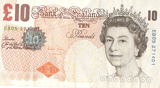
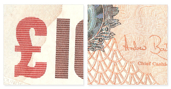
I had first learned about guilloches a few months ago while reading a blog post by Aegir Hallmundur of Ministry of Type. Every one has of course seen guilloches before, but how many people know that they’re called guilloches? It was really interesting to discover that they even had a name!
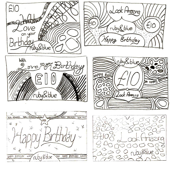
I presented some very rough sketches to Ruby along with some information on guilloches and she liked the idea.
A bit more searching led me to this fantastic guilloche maker by Tom Beddard of www.subblue.com and I had fun making various shapes with increasing complexity. The one thing that this was missing though was the ability to actually save the design into an editable form such as an .ai or .pdf file.
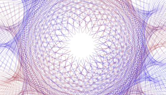
Because I couldn’t save the guilloches made into a usable format, I unfortunately had to attempt to make them manually in Illustrator instead, which meant that they would be nowhere near as complex. I tried a few different things, but nothing looked quite as good as using mathmatical processes. I had a feeling that my wish to use guilloches in the design of the gift vouchers was going to be a dead end due to being unable to find something easy (and free) to use instead.
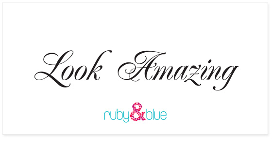
Not willing to be too dead in the water just yet, I looked again at the various design elements of a banknote and the main thing that stood out even more than the guilloches was Bank of England, in the custom script typeface. I decided to try and incorporate this into a gift voucher design. Ruby had already said that she wanted to use “Look Amazing” to support her logo and I thought this was the perfect opportunity to do so.

I began researching into some similar typefaces that might match the one used on banknotes and found one that might work quite well. What became apparent very quickly was that simply typing out “Look Amazing” and digitally adding some extra swirls wasn’t going to be enough. It didn’t look natural enough. So, I printed a few copies of “Look Amazing” and started adding the swirls manually instead.
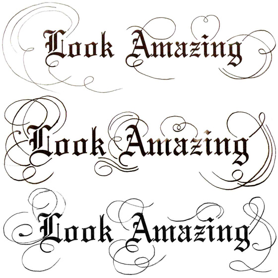
After producing a number of these sketches, I scanned them back into Illustrator and began tracing the swirls of various revisions, before adding the final one to a voucher design that I had been working on and it looked quite fitting.
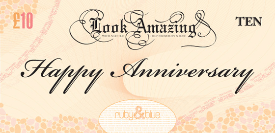
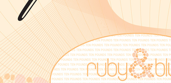
I was quite happy with how the voucher had turned out, even though the guilloches had been made manually instead of mathmatically. Additionally, although it didn’t look exactly like a banknote, it gave just the right feeling of one. A feeling that the voucher had value.
I wanted to present Ruby with three different concepts for her to choose from. As you can see above, Ruby&Blue’s logo focuses on making the ‘&’ out of small pebbles and for the next concept, I wanted to try and bring these into the design even more.
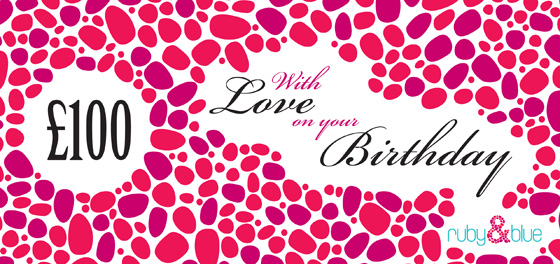
Although not as complex as the first voucher, this one actually reflected Ruby’s site in a better way because it was a little more contemporary than the guilloche design. However, I felt that it was a little too heavy handed and that the logo in particular was overshadowed by all of the surrounding pebbles. I liked the idea of keeping the voucher clean, but I also liked the idea of incorporating guilloches somehow and so for the third concept, I wanted to try and get a mix of both things.
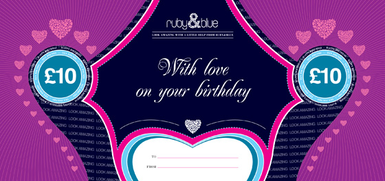
In this design, I felt that the elements were much tighter and better reflected Ruby’s website. Although the guilloche version was visually interesting, it didn’t say the right things about Ruby’s brand, whereas I believe that this design does. Ruby agreed and we went forward with this design.
There were some small changes to the design. Because Ruby would be printing the vouchers herself, some of the finer typeface strokes would not print properly. This meant a change of typeface for something a little thicker that would print even at a tiny size.
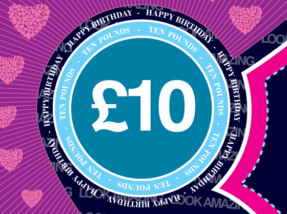
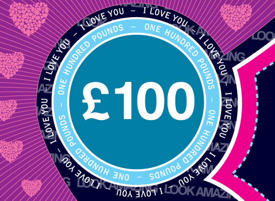
For the main occasion messages such as “I love you”, “Happy Anniversary” and “Merry Christmas”, I wanted a typeface that would make the words stand out. I considered using the same typeface that I used for “Look Amazing” in the guilloche design, but it didn’t quite work. Instead, I opted for a font called Renaissance, which has some beautiful letterforms for its capital letters.
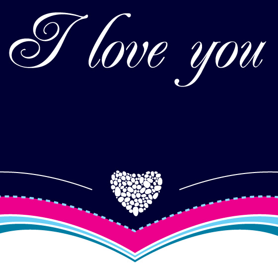
Once the front of the voucher was finalised, it was time to design the back of it. A much easier job. On the front of the voucher, I had included some hearts made out of the same pebbles that made up the ‘&’ in the Ruby&Blue logo so I included them on the back. However, after designing it, Ruby asked for space to be made to include a message box so that customers could use the back of the voucher to write something to whoever they were giving the voucher to. The back was redesigned to accomodate this.
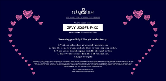
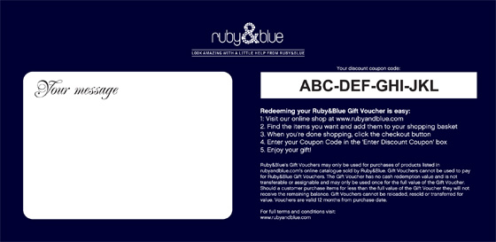
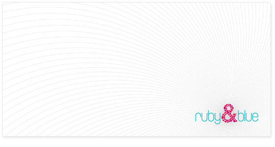
The last thing to be designed was an envelope, which the gift voucher would be presented in. I didn’t want to make this as complex as the voucher, but to simply give a few hints as to what was inside. Three concepts were designed for the envelope and the second was chosen.
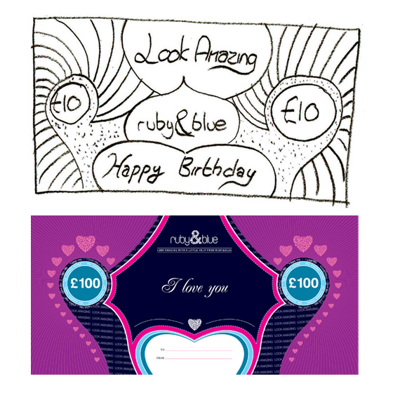
Both Ruby and myself were happy with how the design of the voucher and the envelope had progressed. For me personally, I had really enjoyed working on the project and I thought it was quite interesting to see how one of my early sketches ended up being the framework for the final design.
Ruby was a great client to work with and one which I ended up working with again to produce some of her site images. As Ruby has just officially launched the website, I’d like to wish her luck in her new business and hope that the gift vouchers are enjoyed by those customers wishing to purchase them.
