Small Project: 75th Charter Night

It’s difficult to describe what Round Table is and so instead, I shall quote from Round Table’s website:

The first Round Table was formed in Norwich in 1927. …a need existed for a club where the young business men of the town could gather on a regular basis to exchange ideas, learn from the experiences of their colleagues and play a collective part in the civic life.

Today, Round Table hosts a number of events and has numerous organisations (or Tables) all over the UK. They are also responsible for producing the annual Chester Charity Beer Festival, which I worked on last year. Chester’s Round Table hired me to develop a flyer to promote their 75th Charter Night. A celebration of Round Table open to anyone. In addition to being their 75th Charter Night, it was also a black tie event and the flyer needed to reflect that.
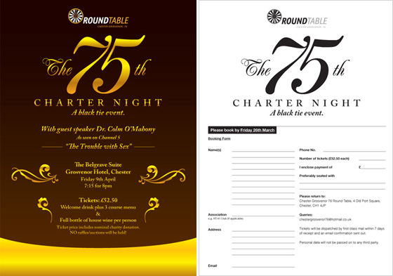
The front and back of the flyer.

Round Table also needed a ticket to go with the flyer to send to those who would be attending the event. The ticket was designed at A7 so 8 would fit on an A4 page, reducing printing costs. NickĀ  Wheeler, Chairman of Round Table took responsibility for printing.
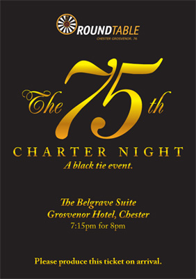
Ticket for the 75th Charter Night.

Although a small job, it’s always nice to add a touch of design to an event which may otherwise not have any. I hope that it does the job at getting people to the event.

Small project: Vital Accessories

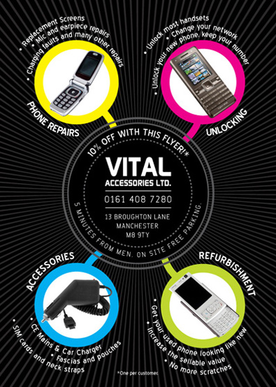
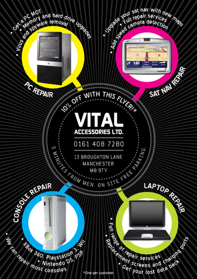
As well as logo design, branding, publicity and unique solutions to a problem, I also do some run of the mill work including promotional flyers, which I think is worth mentioning here. I worked with Vital Accessories to produce an A5, colour, double sided flyer that promotes their mobile phone repair workshop.

Vital Accessories flyer (Front)
Vital Accessories flyer (Back)

The flyer attempts to break out of the trap that many of these type of flyers fall into, with oversized type and far too much information to the point where it’s overwhelming for the viewer. Instead, this flyer strips the information down to a few bulletpoints with some relevant images to go with it. A simple project, but one which will hopefully help Vital Accessories to gain more business than its rivals.

If you’d like to work together to produce something similar, just get in touch and I can help you promote your business too.

How to put your customers off

expressperts

krazypizza
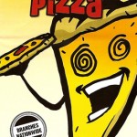
Would you order pizza from this guy?

In my last post about fast food leaflets, I wrote about how clarity of information is key to getting as much business from your potential customers as possible. This post is about how to turn them off.

Last week, I recieved this leaflet through my door and it certainly stood out from the usual fast food leaflets I recieve. Would you really be attracted to food with spiral eyes and a mouth, serving what appears to be a slice of himself to you? I find that quite off putting. Disturbing, even.

And then there’s that header. “The pizza delivery expressperts”. Perhaps it’s just me, but trying to combine two words like that while worth a try at the design stage, is certainly not good enough to put on the front of a leaflet, regardless of what it’s for. You do have to wonder who designs these things and, more importantly, why the client signs off on it.

To their credit, “Krazy Pizza” have one of the clearer menu designs inside, but the leaflet’s cover would put me off. It just doesn’t look healthy at all, does it?