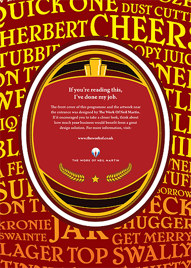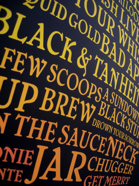
The Chester Charity Beer Festival aims to provide the public with a great 3-day event of music, food, and of course beer. With over 70 beers to choose from, the beer festival is something any beer connoisseur should try. To help make the festival even more enjoyable, I offered to design the front cover of their programme guide, along with some A1 posters that would be displayed around the large marquee tent where the event was hosted. You can see the full project here.
Originally, I had simply wanted to place an advert for myself in the programme guide, as the festival relies on local businesses and donators to fund a lot of the costs that naturally accumulate when hosting such a big event. After getting in touch with one of the organisers of the event, they told me that they were unsure of how much exposure I would get. However, they offered me the opportunity to develop something larger than just an advert in the programme guide, suggesting a piece of artwork similar to my 10×10 project. Something large that could be hung inside the marquee tent. I was more than happy to do this because not only did I want to advertise myself, but also the festival itself.
I already had an idea of what I wanted to do for a piece of artwork and began asking people for as many words as they could think of for drinking a beer. It was really interesting finding out just how many words and phrases there are! I tried to stay away from words and phrases for getting drunk, because that’s not what the festival was about and besides, pretty much any word can be used to describe getting drunk! (Curtained, trollied, windowed, etc.)
While people were replying to my request for words, I began work on the front cover of the programme guide. I had managed to find a copy of 2006’s guide and it looked very bland and unappealing. The beer festival is about having fun and I wanted to communicate this with some tighter branding. I began research into beer logos, beer labels and beer mats.
By this time, I had received enough replies to my request for beer words and I started working on the poster. I had a clear idea of what I wanted to do with it, transforming the words into a giant pint glass. I was really happy with how it looked. I love how flexible typography can be with things like the mesh tool in Illustrator. It’s amazing how typography can form into image. Once the cover was complete, I sent it to the organisers for inspection and they came back to me with the request to add their logo into the design. I then used it as a template to then design my own advert that was to be in the programme guide. I wanted it to relate back to the front cover so that when people came across it, they’d know immediately that it was connected to the event and that I was responsible for designing it.

The programme guide didn’t look right with just a plain colour as the background and so I decided to use the poster design instead. I believe it adds something really nice to the overall design of it.
The morning of the first night of the festival, I headed down to the marquee for the first time to personally put up five A1 posters. I had the opportunity to see the programme guides all printed out, ready for the night ahead. It was really nice seeing so many of them. So nice seeing my artwork mass produced.

I returned the night after to attend the festival itself. It was a fun night and an incredible amount of people attended. As I walked into the festival, I saw lots of people holding the programme guide, reading through it and stuck in their back pockets as they sampled the range of beers on offer. It was fantastic seeing so many people with my artwork in their hands. A total of about 700 people attended the event.
A day or two later, I received an email from the organiser, saying that I had had some interest in the A1 posters and they wanted to take one. I was happy that they’d generated interest.
I really enjoyed working with the festival to make it visually appealing and would happily work with them again to produce next year’s festival, with an even bigger opportunity to produce tighter branding. I look forward to 2010’s festival.
