New Project: Post-it Notes

postitnote

The University of Chester has a dedicated campus for all of its creative students known as Kingsway. This houses all students studying graphic design, fine art, performance and all other creative courses. However, what was clearly missing from the walls of the campus was the one thing that all of its students had in them – creativity. This small, self-generated project was aimed at trying to solve this problem through the use of Post-it notes. You can view the project here.

I had wanted to do something viral-like at the University for quite some time, but hadn’t thought of anything good enough to put into practice. Additionally, with lots of coursework already on my plate, I couldn’t do anything that would be time consuming. For some reason, I had started noticing that the walls of the campus were awfully blank, moreso than usual and I really wanted to change this. I had also noticed that a lot of the noticeboards that were located around the walls did not have anything visually interesting on them, if anything at all. It seemed a shame to not take advantage of all of this empty space with something more creative.

While using some of the trademark neon yellow Post-it notes for my coursework, the idea came to me to incorporate them into something I could use around University. It was then that I decided to purchase a big block of notes in yellow, pink, green and orange and put as many of them to use as possible by writing short messages on each one of them and then sticking them around campus.

I spent the best part of two hours simply writing messages onto lots of notes, only to realise that I had foolishly written the messages on the wrong side! In other words, I’d written them on the side with the sticky strip, meaning that when stuck to the wall, the message wouldn’t be visible. It had taken me about 30 messages to realise this and I had to start again.

Once all of my messages were written, I simply left them in my bag and whenever I went to University and had the chance, started sticking them to the walls wherever they looked like they would be read. I also took care to do it while no one was looking as I didn’t want this project to be associated with me. This wasn’t because I was scared of getting ‘caught’, but simply because I didn’t want this project to be about advertising myself. I wanted it to be about promoting creativity in others. This is why it took quite a number of trips to and from University to finally get the notes stuck up onto walls.

Over the days and weeks, some fell off and some were pulled off, but quite a number of them stayed exactly where they were. One day, I walked past one of the notes I had stuck up. It simply said “Quantity doesn’t equal quality” and I noticed that someone had decided to write underneath it. I can’t quite remember what they wrote, but it was something along the lines of “But quality can be found in quantity”. Touché indeed. I found it incredibly interesting that someone had decided to take the time to reply to what is just a bog standard Post-it note and with a reply that was quite obviously thoughtfully written.

A few weeks later, someone had replied to another of the notes. This one simply read “Do it now”, to which someone had replied “Yeah baby!”. Not quite the message I wanted to communicate, but again, incredibly interesting that someone had taken the time to reply to it. I had never expected that people would actually write on the notes. My aim was to simply make people think about what was on the notes and to brighten an otherwise blank wall. It was truly interesting that people had decided to interact with the messages.

Although I would not call this project time consuming or visually artistic, I thought it was important to add it to my portfolio of work because aside from being a graphic designer, I feel that I am a problem solver. Someone who can come up with an idea that appeals to its target audience. Here, the problem was simple: How do you make a blank wall more interesting in a low cost way? And my answer was through the use of Post-it notes, which worked far better than I had originally thought. I’m not quite sure if this would count as a ‘viral’ campaign, but it certainly had a positive effect and I’m pleased with the outcome.

New Blood ’09

newblood

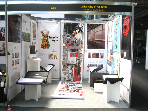
Last week, I attended D&AD New Blood at Olympia in London. A fantastic exhibition of University students displaying their work over the course of three days.

I had been lucky enough to be chosen to be one of the students representing the University of Chester’s graphic design course. A total of nine students were chosen. We were informed roughly a week or two prior to the actual event, which didn’t leave much time to put together our display. At the time, I was also still working on producing the course’s own exhibiton, which meant that I had a lot to do in a very short amount of time.

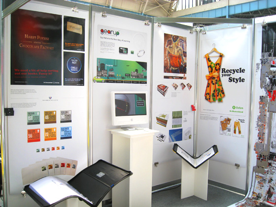
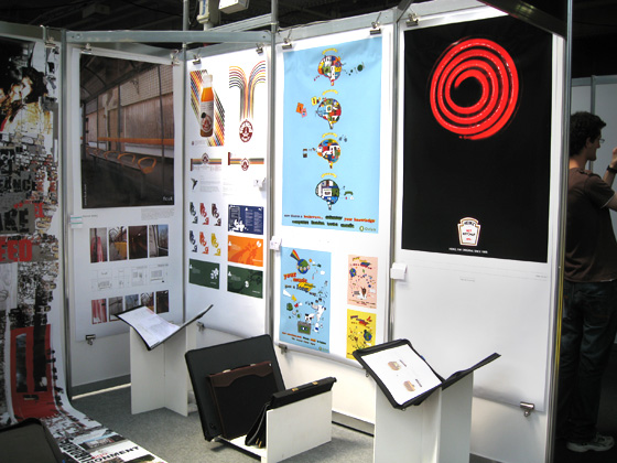
We had been told that the rough dimensions for the display board were 200x90cm, which in theory was a huge amount of space but it all depends on how you use it. We had also been told that it was a good idea to keep the number of projects that we wanted to display to one or two so as not to overload the board. For my choices, I decided to go with my Oxfam posters and my Royal Mail stamps. I believe that the work for Oxfam is some of the best work I’ve completed this year, while the Royal Mail stamps show that a good idea does not necessarily have to come with bells and whistles.

After the boards were completed, we then focused on our own exhibition. I had exhausted my supply of business cards by the end of it, which left me with just five days to get more printed. To their credit, after I ordered them on Sunday night, Cards Made Easy proofed the artwork by Tuesday, printed them and then delivered them Friday morning. This is the second time I’ve used them to print my business cards and I’ll certainly be using them a third time. Previously, I had ordered 50 cards, but because I wasn’t sure just how popular the event would be, I decided to print a batch of 100 this time.

A group of five of us decided to head down to London on Sunday, the night before the exhibition began because we had to be at the Olympia at 10am to set up. I’ve been to London before, but I can’t say that I’ve had the pleasure of discovering much of it. On Sunday, we did just that, taking a trip to the beautiful Hyde Park, Leicester Square and then to the London Eye and Big Ben. We got back to our hotel about midnight.

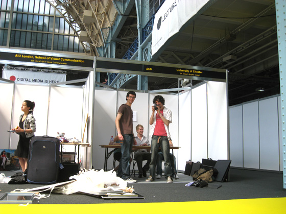
Upon travelling to Olympia the next morning, we got our first look at the area in which we’d be exhibiting. It’s a huge place, with roughly 200 different Universities displaying work from over 2,000 students. Some Universities had bought more than one stand, knocking them together to form an entire row of exhibition areas dedicated to them, with a total of 15-20 panels. We had just 9, but we intended to use them well.

Our blank exhibition space, just before we set up.
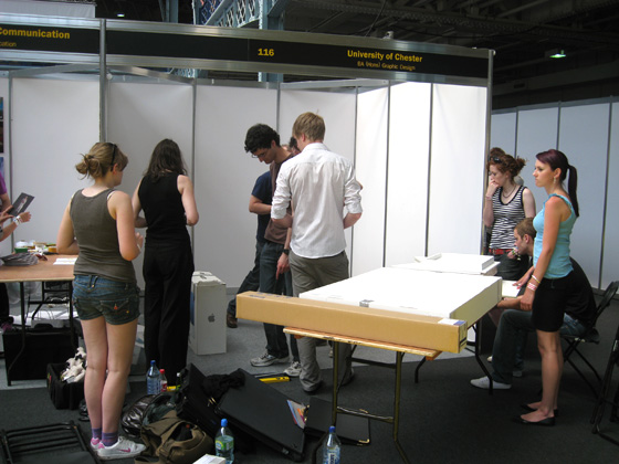
Boxes, portfolio display stands and many rolls of work.

One of the things that had been difficult to come up with a solution for was where to put everyone’s business cards. Since the area we had was quite small, it didn’t really allow for a table, which meant that they had to be either nearby or somehow over the work itself. Mike Moore, one of the tutors came up with the idea of making a U shape out of some unused mounting board. Each person’s 200cm tall artwork would slip into the slit of the U, and then one side of it would be attached to the panels, while the other side would have a business card glued to it. This would then leave a small platform for each person’s business cards. It worked surprisingly well, as long as we didn’t put too many cards on the stand. Its weight was limited to about 5 cards at a time.

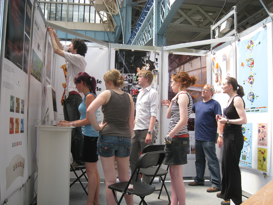
Nearing completition of our space.
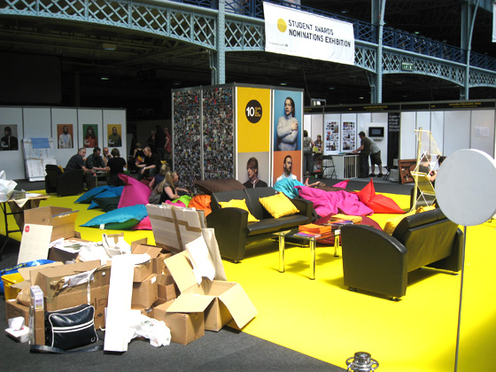
The fantastic "Hub", with lots of bean bags to relax on.

We were lucky enough to be right by the “Hub”, a long strip of yellow carpet running right down the middle of the exhibition with couches, tables and bean bags scattered around a D&AD tower with people’s photos on it. It didn’t take long before we were quite relaxed on the bean bags!

After about 90 minutes of setting up, the space was complete and it looked quite good. Because our space was small, it meant that we had to continually rotate people’s portfolio’s throughout the three days so everyone got a fair chance of displaying their work, but overall, our stand looked great.

Our exhibition space.
Our exhibition space. Mine on the far left.
Our exhibition space.

Opening night of the exhibition was very busy. I was surprised at how popular it was. Luckily, the D&AD had issued different coloured wristbands to everyone, depending on if the were exhibiting or visiting. Red for exhibitors, green for friends and family and yellow for VIP. It didn’t take long to discover this and it quickly became the aim of all of us to keep a look out for any yellow-banded people as we knew they were most likely from industry.

Over the course of the three day event, I managed to speak to a handful of people from industry and hand out a few of my cards. I can’t say that I handed out many, but it was good to start getting my name out there.

One of the highlights of London came just after we had packed up the exhibition. On our way back to the hotel to pack up, I met none other than Matt Dent, winner of a pretigious D&AD Black Pencil for his work on the reverses of all UK coinage. He was waiting for the same train as me. What was quite interesting was that even though his work on the reverses had won him such an important award, I don’t believe as many people know his face as his name. The train station was completely packed with people who had just left the exhibition, but it was clear that no one knew that there was a black pencil winner in amongst us. In fact, I had seen him walking around the exhibition earlier in the day and couldn’t quite put a name to the face and I didn’t want to go over to him in case I was completely mistaken. Luckily however one of my friends decided to take the leap and go and talk to him and I followed shortly after to find that it was indeed Matt Dent.

We spent a good half hour speaking with him while waiting for the train. My friend showed him his portfolio of work while waiting, with me holding it up while he flicked through it. To my friend’s credit, he managed to get through his entire portfolio just as the train pulled in. We both gave Matt our business card and he gave us his. We were getting on the same train anyway so we continued chatting while travelling and found out about how he had started in the industry. We also discussed what we wanted to do next after University. Matt is an incredibly friendly and approachable guy and even on a hot, busy train, he was more than happy to chat about things. I really appreciated his time.

All in all, I believe that going to New Blood was a great experience and one which I may even return to next year. I may not be an exhibitor next year, but I could still see a hell of a lot of fantastic work on display and meet a lot of incredibly talented students and skilled people from the industry such as Matt Dent. A great exhibition.

New projects coming soon

cover

You’ll have to forgive me for not updating more often recently but University is coming to a close. I’m working as much as I can on getting my projects up to scratch and submitting them for the deadline of 12th May. It’s an incredibly nervous and stressful time for everyone who is in the same position as I am.

I’m looking forward to being able to use these entries as a way to offer insight into how I’ve been working on my projects, offering screenshots and rough sketches. I really believe that seeing this kind of thing helps other designers. For example, David Airey always offers great insight into how he works through his work, offering glimpses into his paper-based work and digital variations. I’d like to go one step further than that, though and provide a more detailed analysis of one or two projects, showing exactly how I’ve arrived at the final piece of work.

I’d like to do this for two reasons. Firstly, because from one designer to another, I always think it’s interesting to see how someone works but perhaps moreso, from a non-designer’s point of view, I think that the world of graphic design can sometimes be a ‘private club’. A profession with a very unusual and hard to break into language. Since graphic designer’s clients are usually not design-orientated, it is of course important to make design as accessible as possible to them and I hope that through offering a walkthrough of my work, I’ll help people understand how I work.

I’m also looking forward to uploading new projects, including some unexpected charity work that I’ve recently completed for Chester Charity Beer Festival. The festival begins 14th May and lasts until 16th. Last year, the festival managed to raise £7,000 for charity and I’m hoping that this year they might raise even more than that. I’m waiting until the festival is over to upload the project because I intend to take some photos of the work that will be on display at the festival. Stay tuned for that.

In the meantime, please do get in touch if you’d like to discuss working together. I’d love to hear from you.

We are go

www.theworkof.co.uk is now up, running and ready for business.

The design, while very simple is aimed at showcasing my work, rather than being impressed with the website itself. Web design is not something I’m interested in, but I’ve made sure that the work is presented in a way which is easy to view and easy to navigate.

You’ll notice it’s currently snowing over there, too.

I’m really happy to finally get my site redesigned. It means I can now continue to upload any new work to it, whereas with my previous design, I was holding off on doing so. On The Work Of now, you’ll find many of my University-related projects, along with a good dose of freelance work. When I upload new work, check back here for a detailed rundown of what it took to create it.

The design, while at a finished stage will undoubtedly undergo some tweaks over the next few weeks, but for now, I’m quite happy as it is. How about you? What do you think? Leave a comment here or send me an email via the site. Thanks!

The Final Countdown

Last night I began the work of uploading all of my artwork to my newly designed site. It didn’t take as long as I thought, which is a good thing. It means that adding a single piece of work in the future will be quick and simple.

Once it was all uploaded, I had a quick browse through it and tried to put myself in the position of a potential client or visitor and I felt quite uncomfortable looking at my own site. I wasn’t happy with how it looked. I didn’t think that I had displayed my work well enough. After viewing it a few more times, I’m slowly coming around to the idea. It’s strange, really. I mean, I designed it exactly how it looks, no one else so in theory, I should be completely happy with it, but I’m not. I think perhaps what I’ve done is design the website as a standalone design, rather than considering what the site will be used for. I’ll see how things go. It’s certainly an improvement on my previous design, though.

The only thing left to do is point my domain name at the site, since it’s hosted somewhere differently to my current site and this is proving problematic. I should hopefully get that sorted within the next few hours. Hopefully. And then all that’s required  is a little bit of patience for the domain to take its time repointing to the site. I’m excited about finally getting it launched.

It will be a soft launch, though. It’s coming up to Christmas, which means I can’t really do much self promotional work in terms of actually getting out there and making people aware of me, simply because it’s a little too expensive to get anything printed. While at University I can use the discounted printing to my advantage. I have a few ideas on how to increase my hits to the site.

One thing that I’m hoping I’ll be able to promote along with my site is this blog, which is proving more popular than I thought it would be, considering I’ve yet to link to it anywhere. Although it’s not been advertised anywhere, I’ve currently recieved 200 hits to it, which my article on the BBC News theme tune being a good four times more popular than any other post I’ve made so far. It’s nice to see that there are people really interested in the same kinds of things that I am.