Viral Man: The Making Of – Part 1

viralmanthemakingof

Because of my unfortunate hard drive failure a few weeks ago, I lost a lot of the photos I had taken of everything that I had designed for the University of Chester last month. I had planned to upload everything to my portfolio on the same day that the campaign was launched at the University but because I didn’t have it all, I decided to hold off. Instead, I’m waiting for them to send me some of the assets that I designed so I can take more photos of them.

In the meantime however, I thought it might be a good idea to give you a walkthrough of how I, along with three other people came up with the campaign that is now on show to over 15,000 students over two main campuses and multiple university-owned premises. I plan to write about five of these “Making Of” posts in the run up to posting the work in my portfolio. It basically gives me a chance to source some photos of what I need, while keeping my blog updated.

So, in this first entry, I’d like to start by telling you how I became part of the project and what happened in the first week. I’ll try not to make it too long winded, but also interesting enough to read! The first part doesn’t have any nice visuals to go with it I’m afraid, but it at least gives you an idea of how the job came about.

Part 1 – The Making Of The Team

At the beginning of July, I wrote about how I went down to London to display my work at the D&AD’s New Blood event. It was a great experience although it could be argued that in terms of finding work via it, it wasn’t as useful. I don’t regret doing it, because it was a fantastic experience.

Prior to exhibiting, we had been told that it wouldn’t just be the graphic design department that would representing the University of Chester, but also the advertising department, who had been nominated for a D&AD award. It was a coincidence that two of the advertising students who were exhibiting happened to be staying at the same hotel as a few of us graphic designers, which allowed us to get to know each other a little better. In addition, Kate Sillitoe, one of my second year tutors was now responsible for teaching advertising and so again, there was a little bit of a crossover.

At the end of the three days of exhibiting, me and the other seven people who had also exhibited started to pack up. Kate pulled me and few others aside to tell us about a job opportunity at the university over summer. She said that the university was keen to get an early start on protecting and preventing people from getting Swine Flu and to do that, they were really interesting in hiring students to come up with a campaign that would appeal directly to students. The job would be full time for four weeks and would take place from the middle of July to the middle of August and would take place at the university’s second, smaller Warrington campus, rather than the larger, main campus at Chester.

I didn’t have any other responsibilities lined up after the exhibition and so I was keen to find out more information about the job, as was one of my classmates, Hannah Bradshaw and the two guys from advertising, Jerry Clark and Will Bollen. I gave Kate my contact details and she said that she’d be in touch.

Getting the job

After a few emails back and forward from Kate, I was told that I would be called by communications director of the university, Jayne Dodgson. I waited eagerly for the phonecall. At the same time, I was speaking to Hannah who was also waiting for the same call. We didn’t quite know how many people had shown interest in the job or what sort of questions we’d be asked.

When the phonecall did come, I was told that I was on speakerphone to two people.  Over the course of 20 minutes, they asked what I could bring to the team and what sort of things I thought could be pushed forward to deliver a successful campaign. As I said, I didn’t quite know what questions were going to be asked so I did feel like I was put on the spot for a number of them, but at the same time, felt confident in my answers. At the end of twenty minutes, they thanked me for my time and said they’d be in touch. A few minutes later, Hannah got the same call and again, they said they’d be in touch. It wasn’t until the next day that we were told that we had successfully got the job and that we started a few days later.

First day

My first day was a Thursday and I had to be there for 9am. Kate said that she would be meeting us and that we’d be attending a Swine Flu briefing. I had only ever been to Warrington twice before and both times were from Chester, rather than Liverpool. I had spent the night before finding out train times and realising that it would take me 90 minutes to get there and indeed 90 minutes back as well. A long time, but I thought it’d be worthwhile as I’d still be paid more than I was spending and perhaps moreso, I would have an excellent piece of work to add to my portfolio.

Hannah and I met each other at the campus and then made our way to where we were meeting. It was there that we met Jerry, Will and Kate. After some quick introductions, we headed over to the Swine Flu briefing where we met everyone else, including Jayne Dodgson who we would be reporting to over the next few weeks. The next hour was spent taking notes from Gay Rabie, the university’s senior health advisor. All four of us made lots of notes on her presentation in the hopes that it would help our project further down the line.

After that and for the rest of the day, me, Hannah, Jerry and Will took some time to get to know each other and get a feeling for what skills we could bring to the team and we started jotting down all of the potential ideas we had each been cooking up by ourselves over the previous week. Many of the ideas, naturally, included pigs in some way or another, but we all dismissed anything pig-related fairly early on because it would send the wrong message. Still, it was important to get those ideas out on paper to see how they could possibly be modified to work.
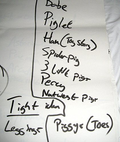
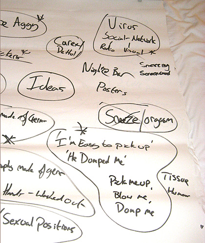
How many pigs can you think of?
A few ideas
A few ideas

Some of the more interesting ideas that we came up with were the use of ‘Pick up lines’ such as “I want to blow you” and “He dumped me!”, both referring to the use of tissues. We thought these were cheeky enough to be appealing to students, while not being too offensive to use throughout the campuses. Another idea which I had was to use a poster campaign of people looking like they’re having an orgasm, but it’s actually a sneeze. There were some great ideas very early on from all four of us.
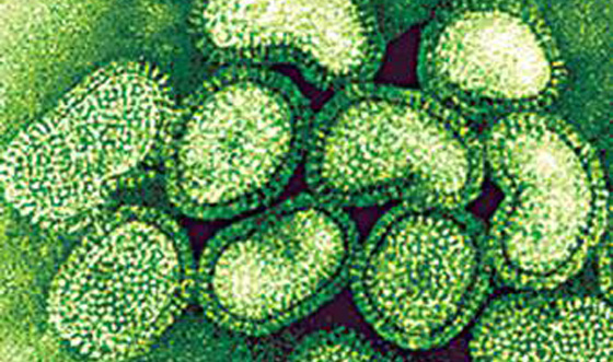
Swine Flu under a microscope.
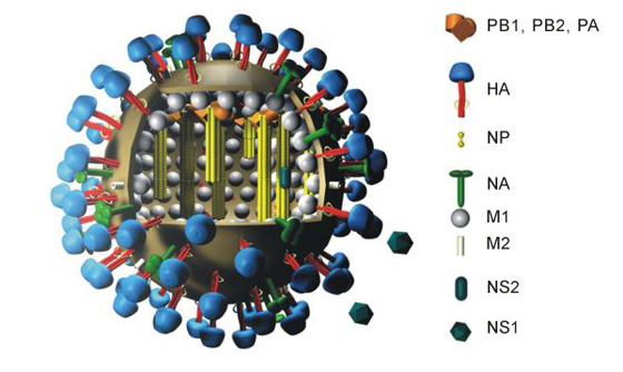
An illustrative look at Swine Flu. Image via: http://www.flickr.com/photos/28889807@N05/3689142069/

On Friday, we continued with further research into what the virus actually looks like to see if we could incorporate that into anything. We found that the virus was quite spikey in nature when looked at from an illustrative point of view. With this in mind, we thought it’d be a fantastic idea to incorporate this shape into some sort of physical spikey ball that could then be given to all students as an induction gift.

Our first two days of working on the project had proved to be quite productive, as we were putting together some good ideas after just two days.

In the next entry: Choosing our final ideas and presenting them

New Project: Post-it Notes

postitnote

The University of Chester has a dedicated campus for all of its creative students known as Kingsway. This houses all students studying graphic design, fine art, performance and all other creative courses. However, what was clearly missing from the walls of the campus was the one thing that all of its students had in them – creativity. This small, self-generated project was aimed at trying to solve this problem through the use of Post-it notes. You can view the project here.

I had wanted to do something viral-like at the University for quite some time, but hadn’t thought of anything good enough to put into practice. Additionally, with lots of coursework already on my plate, I couldn’t do anything that would be time consuming. For some reason, I had started noticing that the walls of the campus were awfully blank, moreso than usual and I really wanted to change this. I had also noticed that a lot of the noticeboards that were located around the walls did not have anything visually interesting on them, if anything at all. It seemed a shame to not take advantage of all of this empty space with something more creative.

While using some of the trademark neon yellow Post-it notes for my coursework, the idea came to me to incorporate them into something I could use around University. It was then that I decided to purchase a big block of notes in yellow, pink, green and orange and put as many of them to use as possible by writing short messages on each one of them and then sticking them around campus.

I spent the best part of two hours simply writing messages onto lots of notes, only to realise that I had foolishly written the messages on the wrong side! In other words, I’d written them on the side with the sticky strip, meaning that when stuck to the wall, the message wouldn’t be visible. It had taken me about 30 messages to realise this and I had to start again.

Once all of my messages were written, I simply left them in my bag and whenever I went to University and had the chance, started sticking them to the walls wherever they looked like they would be read. I also took care to do it while no one was looking as I didn’t want this project to be associated with me. This wasn’t because I was scared of getting ‘caught’, but simply because I didn’t want this project to be about advertising myself. I wanted it to be about promoting creativity in others. This is why it took quite a number of trips to and from University to finally get the notes stuck up onto walls.

Over the days and weeks, some fell off and some were pulled off, but quite a number of them stayed exactly where they were. One day, I walked past one of the notes I had stuck up. It simply said “Quantity doesn’t equal quality” and I noticed that someone had decided to write underneath it. I can’t quite remember what they wrote, but it was something along the lines of “But quality can be found in quantity”. Touché indeed. I found it incredibly interesting that someone had decided to take the time to reply to what is just a bog standard Post-it note and with a reply that was quite obviously thoughtfully written.

A few weeks later, someone had replied to another of the notes. This one simply read “Do it now”, to which someone had replied “Yeah baby!”. Not quite the message I wanted to communicate, but again, incredibly interesting that someone had taken the time to reply to it. I had never expected that people would actually write on the notes. My aim was to simply make people think about what was on the notes and to brighten an otherwise blank wall. It was truly interesting that people had decided to interact with the messages.

Although I would not call this project time consuming or visually artistic, I thought it was important to add it to my portfolio of work because aside from being a graphic designer, I feel that I am a problem solver. Someone who can come up with an idea that appeals to its target audience. Here, the problem was simple: How do you make a blank wall more interesting in a low cost way? And my answer was through the use of Post-it notes, which worked far better than I had originally thought. I’m not quite sure if this would count as a ‘viral’ campaign, but it certainly had a positive effect and I’m pleased with the outcome.

New Blood ’09

newblood

Last week, I attended D&AD New Blood at Olympia in London. A fantastic exhibition of University students displaying their work over the course of three days.

I had been lucky enough to be chosen to be one of the students representing the University of Chester’s graphic design course. A total of nine students were chosen. We were informed roughly a week or two prior to the actual event, which didn’t leave much time to put together our display. At the time, I was also still working on producing the course’s own exhibiton, which meant that I had a lot to do in a very short amount of time.

We had been told that the rough dimensions for the display board were 200x90cm, which in theory was a huge amount of space but it all depends on how you use it. We had also been told that it was a good idea to keep the number of projects that we wanted to display to one or two so as not to overload the board. For my choices, I decided to go with my Oxfam posters and my Royal Mail stamps. I believe that the work for Oxfam is some of the best work I’ve completed this year, while the Royal Mail stamps show that a good idea does not necessarily have to come with bells and whistles.

After the boards were completed, we then focused on our own exhibition. I had exhausted my supply of business cards by the end of it, which left me with just five days to get more printed. To their credit, after I ordered them on Sunday night, Cards Made Easy proofed the artwork by Tuesday, printed them and then delivered them Friday morning. This is the second time I’ve used them to print my business cards and I’ll certainly be using them a third time. Previously, I had ordered 50 cards, but because I wasn’t sure just how popular the event would be, I decided to print a batch of 100 this time.

A group of five of us decided to head down to London on Sunday, the night before the exhibition began because we had to be at the Olympia at 10am to set up. I’ve been to London before, but I can’t say that I’ve had the pleasure of discovering much of it. On Sunday, we did just that, taking a trip to the beautiful Hyde Park, Leicester Square and then to the London Eye and Big Ben. We got back to our hotel about midnight.

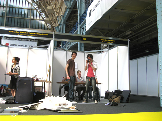
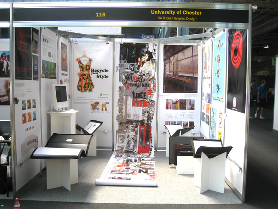
Upon travelling to Olympia the next morning, we got our first look at the area in which we’d be exhibiting. It’s a huge place, with roughly 200 different Universities displaying work from over 2,000 students. Some Universities had bought more than one stand, knocking them together to form an entire row of exhibition areas dedicated to them, with a total of 15-20 panels. We had just 9, but we intended to use them well.

Our blank exhibition space, just before we set up.
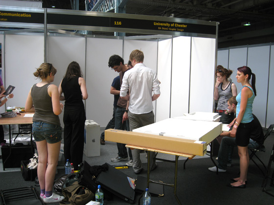
Boxes, portfolio display stands and many rolls of work.

One of the things that had been difficult to come up with a solution for was where to put everyone’s business cards. Since the area we had was quite small, it didn’t really allow for a table, which meant that they had to be either nearby or somehow over the work itself. Mike Moore, one of the tutors came up with the idea of making a U shape out of some unused mounting board. Each person’s 200cm tall artwork would slip into the slit of the U, and then one side of it would be attached to the panels, while the other side would have a business card glued to it. This would then leave a small platform for each person’s business cards. It worked surprisingly well, as long as we didn’t put too many cards on the stand. Its weight was limited to about 5 cards at a time.

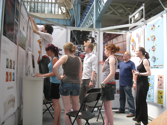
Nearing completition of our space.
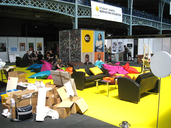
The fantastic "Hub", with lots of bean bags to relax on.

We were lucky enough to be right by the “Hub”, a long strip of yellow carpet running right down the middle of the exhibition with couches, tables and bean bags scattered around a D&AD tower with people’s photos on it. It didn’t take long before we were quite relaxed on the bean bags!

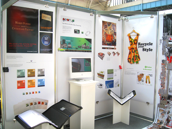
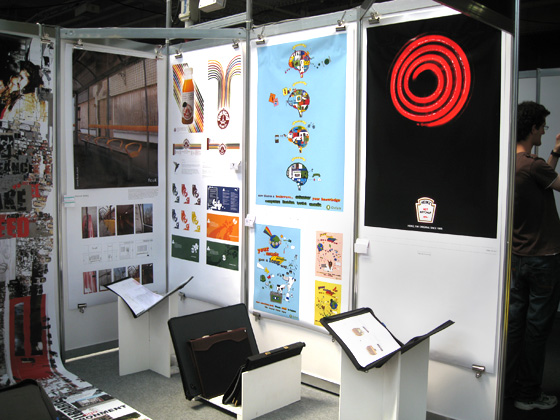
After about 90 minutes of setting up, the space was complete and it looked quite good. Because our space was small, it meant that we had to continually rotate people’s portfolio’s throughout the three days so everyone got a fair chance of displaying their work, but overall, our stand looked great.

Our exhibition space.
Our exhibition space. Mine on the far left.
Our exhibition space.

Opening night of the exhibition was very busy. I was surprised at how popular it was. Luckily, the D&AD had issued different coloured wristbands to everyone, depending on if the were exhibiting or visiting. Red for exhibitors, green for friends and family and yellow for VIP. It didn’t take long to discover this and it quickly became the aim of all of us to keep a look out for any yellow-banded people as we knew they were most likely from industry.

Over the course of the three day event, I managed to speak to a handful of people from industry and hand out a few of my cards. I can’t say that I handed out many, but it was good to start getting my name out there.

One of the highlights of London came just after we had packed up the exhibition. On our way back to the hotel to pack up, I met none other than Matt Dent, winner of a pretigious D&AD Black Pencil for his work on the reverses of all UK coinage. He was waiting for the same train as me. What was quite interesting was that even though his work on the reverses had won him such an important award, I don’t believe as many people know his face as his name. The train station was completely packed with people who had just left the exhibition, but it was clear that no one knew that there was a black pencil winner in amongst us. In fact, I had seen him walking around the exhibition earlier in the day and couldn’t quite put a name to the face and I didn’t want to go over to him in case I was completely mistaken. Luckily however one of my friends decided to take the leap and go and talk to him and I followed shortly after to find that it was indeed Matt Dent.

We spent a good half hour speaking with him while waiting for the train. My friend showed him his portfolio of work while waiting, with me holding it up while he flicked through it. To my friend’s credit, he managed to get through his entire portfolio just as the train pulled in. We both gave Matt our business card and he gave us his. We were getting on the same train anyway so we continued chatting while travelling and found out about how he had started in the industry. We also discussed what we wanted to do next after University. Matt is an incredibly friendly and approachable guy and even on a hot, busy train, he was more than happy to chat about things. I really appreciated his time.

All in all, I believe that going to New Blood was a great experience and one which I may even return to next year. I may not be an exhibitor next year, but I could still see a hell of a lot of fantastic work on display and meet a lot of incredibly talented students and skilled people from the industry such as Matt Dent. A great exhibition.

New Project: One Design Show

As mentioned in one of my Tweets, me and my University of Chester graphic design class had an exhibition on June 18th to show off our finest work to design agencies and the public. As part of the promotion of the exhibition, I was tasked to produce it. This included invitations, posters and a website. You can view the work here.

Producing an entire exhibition is certainly a different experience than simply creating a one-off piece of design. Producing an exhibition means taking everything into account and being responsible for it all fitting together and I have to admit that there were times when it didn’t seem like it was going to be done on time.

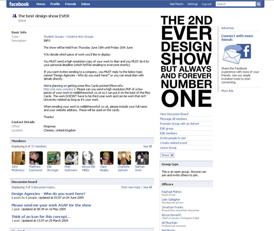
It all started at the beginning of March, when the class were told about the exhibition and the need to form a design committee to help organise and produce the show. A group of seven students originally volunteered to help steer the production in the right direction. Over the course of the next few months, we’d slowly begin to develop the show. To help with this, I set up a Facebook group and liaised with the tutors to send out an email to everyone asking everyone to join it so I could keep the class up to date with developments.

Facebook group for the exhibition

We invited the whole class to begin coming up with themes for the show. Something that the design committee could work with to develop invitations, posters and anything else that was needed. We gave people two weeks to develop their ideas into A3 boards and then discuss them with the rest of the class. This proved to be incredibly successful and from this, the idea of using exaggerated facts and figures was chosen.

The committee begin coming up with a range of facts that could relate to design students and their three years at University. This included ideas, hangovers, swearing, paper pads and computer crashes. These facts were then given large figures, based on one person’s experiences, multiplied by 60 (the number of people on the course). So where the average person may have 20 coffees a week, 60 people will have nearly 200,000 over the course of three years. What was clear after coming up with these facts and figures was that there was one fact that would always remain at 1 – the design show itself. This realisation helped to steer the project into the interesting direction of thinking about the exhibition as a culmination of three years. A filtering of ideas, good times, bad times and arriving at one design show, hence why the show was given the name “One Design Show”.

The idea of the past three years being filtered into one show made me think of how it had been tapered to a point – the point being the show – and this gave me the idea of making the invitation a triangle. Something that had a (literal) point to it. Using a triangle for an invitation would give added impact when sending out to design agencies and colleges because how often does someone recieve a triangle-shaped piece of mail?

One of my tutors had mentioned in passing that the previous year’s students had managed to make the invitation its own envelope and this was something that I also wanted to do to so I began to experiment with triangles and how they could fold up into an envelope to keep it secure.

An initial idea for the invitation for One Design Show

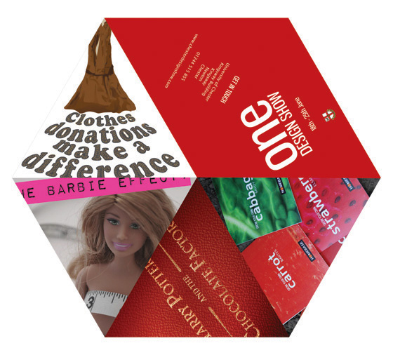
The first idea consisted of a hexagon, with a cut from the centre to the edge. The invitation would then fold up into a concertina, leaving a triangle shape. The problem was that in order for this to work, there needed to be enough copy/image to fill 12 pages (six triangles on one side, six on the other) and this proved to be too much and not necessary. This design also meant that a separate envelope was needed. Additionally, because there was a lack of bleed area between the triangles, it meant that some of the artwork was bleeding into another triangle. In short, the idea failed, but the concept was there.

Sticking with the triangle idea but simplifying it, I decided to try it with three panels next to each other instead. This was much easier to handle and it meant that by adding a tab at the end of the triangles, I could fold the whole thing up and the tab would secure it in place, thereby forming its own envelope. I went with this shape and started on the design work.

The numbers for each of the facts were quite big. I wanted some way of trying to relate these big numbers back to a digital medium and the obvious choice was pixels because that’s what any piece of artwork is made up from at some point or another before being printed. I have always enjoyed the work of people like eBoy and their method of using pixelation as an art form. I wanted to take this and try and make it work on a larger, invitation and poster-sized scale. For this reason, I decided that iconography would be great to use.

The original set of icons and one blown up.

I love working with iconography. It forces you to be economical with your design because you only have a 16x16px area to work with. Communicating a computer crash or a hangover in such a small space is quite an interesting project on its own but I had to make the icons work at print resolution. When a 16x16px image is printed at 300dpi, it is less than 3mm in width. This meant that the icon would need to be blown up if it was to be seen. However, by blowing something up so small to such big sizes, it was inevitable that they would look blurry and messy. Photoshop’s default method of resizing images is “Bicubic”, which is useful for things like photos. However, Photoshop also has another resize method called “Nearest Neighbour”, which allows pixels to stay sharp at larger sizes even when resized to ten times its original size.

The icons that I designed, although nice lacked colour and so a few of them were eventually redesigned including a red coffee mug instead of a white coffee cup and a few of these icons were using on the invitation that can you see on the project page.

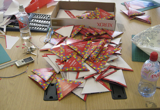
Once the invitations were designed, it was then a case of finding a quote from the printers. The design department didn’t have a large budget to spend on promoting the show and tasked me with finding a suitable printers to print 400 copies of the invitation. Luckily, the invitation was small enough that two would fit on one A3 page, which meant that it immediately cut the costs in half. Unfortunately, due to the unusual shape of the invitation, they could not offer diecutting for price inside the department’s budget and this meant that I, along with a few other people were tasked with cutting them manually.

400 invitiations manually cut and ready to be sent.

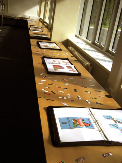
After the invitations were taken care of, the next thing was Moo Minicards. At an early stage of producing the show, I had remembered a great website called Moo. They offer business card-like cards, slightly smaller called Moo MiniCards. I thought these would be a great addition to the show, allowing someone to take something away from it and keep a piece of student’s work with them. My idea was to put a piece of student’s artwork on a total of 100 cards and order 5 packs of them. Each pack costs just £10 so it was well worth it. I requested that all students send me three pieces of their work with their full name and website address. These cards were then scattered all over the tables between each student’s portfolio, making the tables come alive with colour and inviting people to pick them up and look more closely at the work.

Moo MiniCards scattered all over the tables.

The next thing to design were the posters which would help direct people to place in which the exhibition was being held. Originally, the idea was to produce 5 x A1 posters that would be easily visible around the campus. However, after walking around the campus and figuring out where the posters would go, it was clear that more than 5 would be needed. The budget didn’t allow for this. Instead, the posters were designed at A3, which meant that more could be produced and a fraction of the cost of 5 x A1 poster. A series of 8 posters were designed and printed twice, giving me 16 posters to place around the campus in preparation for the opening night.

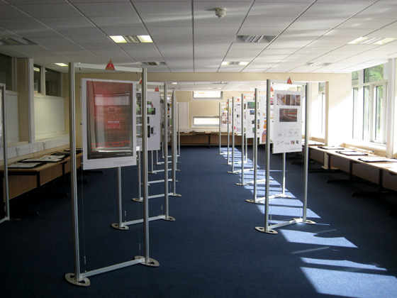
So as to identify each piece of work on display, nametags for each exhibition stand were designed in the same style as the invitation and placed above each stand. Although a very simple part of the whole production process, these triangles, like the invitations had to be manually cut out of card.

The exhibition, ready for opening night.

Finally, a simple website was designed by myself and built by Liam Gallagher, another student on the course, that housed a few student’s work, descriptions of it and information on the show itself including when it was open and how to get there.

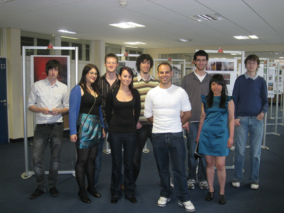
A few of the students who exhibited and/or helped with the show.

Overall, producing the University of Chester’s graphic design show was a really good experience. Liaising with so many people about so many different aspects of the show proved to be very difficult at times due to other coursework-related committments, but I believe that the end result was executed well. In particular, I was really happy with the quality and popularity of the Moo MiniCards that I had designed. As mentioned, I had a total of 500 cards printed and by the end of the seven day opening period of the exhibition, there were less than 100 left. Also, I was pleased to overhear some of the public who attended the opening night of the exhibition express their approval of the posters I had designed. It’s always nice to hear that something you’ve designed has been met with praise.

I’ve really enjoyed working on such a large scale project and I hope that I can do so again in the future.

New project: Chester Beer Festival

cover

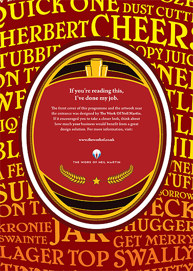
The Chester Charity Beer Festival aims to provide the public with a great 3-day event of music, food, and of course beer. With over 70 beers to choose from, the beer festival is something any beer connoisseur should try. To help make the festival even more enjoyable, I offered to design the front cover of their programme guide, along with some A1 posters that would be displayed around the large marquee tent where the event was hosted. You can see the full project here.

Originally, I had simply wanted to place an advert for myself in the programme guide, as the festival relies on local businesses and donators to fund a lot of the costs that naturally accumulate when hosting such a big event. After getting in touch with one of the organisers of the event, they told me that they were unsure of how much exposure I would get. However, they offered me the opportunity to develop something larger than just an advert in the programme guide, suggesting a piece of artwork similar to my 10×10 project. Something large that could be hung inside the marquee tent. I was more than happy to do this because not only did I want to advertise myself, but also the festival itself.

I already had an idea of what I wanted to do for a piece of artwork and began asking people for as many words as they could think of for drinking a beer. It was really interesting finding out just how many words and phrases there are! I tried to stay away from words and phrases for getting drunk, because that’s not what the festival was about and besides, pretty much any word can be used to describe getting drunk! (Curtained, trollied, windowed, etc.)

While people were replying to my request for words, I began work on the front cover of the programme guide. I had managed to find a copy of 2006’s guide and it looked very bland and unappealing. The beer festival is about having fun and I wanted to communicate this with some tighter branding. I began research into beer logos, beer labels and beer mats.

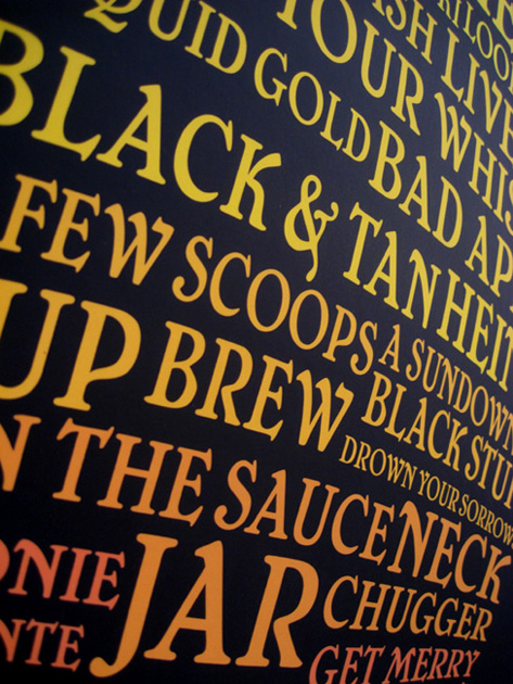
By this time, I had received enough replies to my request for beer words and I started working on the poster. I had a clear idea of what I wanted to do with it, transforming the words into a giant pint glass. I was really happy with how it looked. I love how flexible typography can be with things like the mesh tool in Illustrator. It’s amazing how typography can form into image. Once the cover was complete, I sent it to the organisers for inspection and they came back to me with the request to add their logo into the design. I then used it as a template to then design my own advert that was to be in the programme guide. I wanted it to relate back to the front cover so that when people came across it, they’d know immediately that it was connected to the event and that I was responsible for designing it.

My advert, which was used inside the programme guide.

The programme guide didn’t look right with just a plain colour as the background and so I decided to use the poster design instead. I believe it adds something really nice to the overall design of it.

The morning of the first night of the festival, I headed down to the marquee for the first time to personally put up five A1 posters. I had the opportunity to see the programme guides all printed out, ready for the night ahead. It was really nice seeing so many of them. So nice seeing my artwork mass produced.

Poster for the Chester Charity Beer Festival

I returned the night after to attend the festival itself. It was a fun night and an incredible amount of people attended. As I walked into the festival, I saw lots of people holding the programme guide, reading through it and stuck in their back pockets as they sampled the range of beers on offer. It was fantastic seeing so many people with my artwork in their hands. A total of about 700 people attended the event.

A day or two later, I received an email from the organiser, saying that I had had some interest in the A1 posters and they wanted to take one. I was happy that they’d generated interest.

I really enjoyed working with the festival to make it visually appealing and would happily work with them again to produce next year’s festival, with an even bigger opportunity to produce tighter branding. I look forward to 2010’s festival.