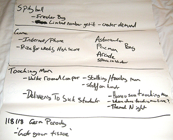
In the last post, I wrote about how our design team was formed and how we had spent two days brainstorming ideas for our first presentation the following Thursday. In this post, I want to tell you about how we arrived at the Viral Man idea.
One of the good things about writing about how Viral Man was formed is that over the course of the 5 weeks, I took some time to fill in a daily activity report. It gave a brief overview of what the team had done that day. It’s amazing how much information you can forget if you don’t write it down!
Fleshing out ideas
Having had a very short week the week before because we started on a Thursday, we had a lot to do before the coming Thursday. Although we had written down lots of great ideas, we still didn’t have an overall plan for how each of these ideas would be tied together. They didn’t have much of a theme running through them. In order to present something to the committee of people responsible for approving the project, I felt it was necessary to narrow the ideas down to three completely different campaigns. In order to do this, I decided to fall back on something which I swore I would never use again once I had finished university – an Initial Response Map (IRM).

An Initial Response Map as it suggests, is a designer’s initial ‘reply’ to the brief that they’ve been given. It shows that they understand what has been asked of them, that they have done initial research into the problem and ideally, show that they have enough information to present the client with three different ideas which can then be taken forward. There’s nothing stopping two ideas being mixed together, but presenting all three to a client is important so that they client can then choose how to proceed. An IRM shows the client that the designer is competent and on the same level.
I had grown to hate IRMs because I always felt that they weren’t as useful as promoted in university. I felt that there was too much emphasis on gathering research, rather than focusing on any ideas that I already had. Whether this is actually true or not, it’s how I felt at the time. However, with a presentation due in four days time, I decided to fall back on it.
Over the course of Monday, Hannah, Jerry, Will and myself sifted through the many ideas that we had and came up with three strong themes that had potential. They were:
- Quarantine
- Touching Man
- Pick-up Lines
Quarantine: A brief overview
This campaign centred around inviting students to be a part of the campaign via social networking, a website and a print campaign. “Quarantine” focused on a fictional student diagnosed with Swine Flu, who had been locked in their room by their friends to prevent him from infecting everyone else. On a special flash-based website, visitors could see the trapped student via CCTV which his friends had installed to monitor his condition. Users would be able to click various things around the room and have the student interact with them.
This idea was influenced by the likes of Subservient Chicken, which allows users to type in a command and watch as a man in a chicken suit does as they ask.
In addition to the website, the campaign would be supported by a poster campaign, inviting users to visit the site and help the student escape. In addition to the poster campaign, special post-it notes would be stuck around campus with unique codes. When a user enters a code into the website, the student does something new. The post-it note idea came about via my own post-it note project which proved successful.
Touching Man: A brief overview
Touching Man centred around a real life characterisation of Swine Flu. By turning Swine Flu into a real, live person, it would give Swine Flu a voice and its own personality. Touching Man would take pleasure from infecting people with Swine Flu by simply touching them. The public would not be able to see him as he crept about, but would exhibit symptoms of Swine Flu right after Touching Man had touched them.
The campaign would be supported by a website and poster campaign, along with a social networking presence on Facebook.
This idea was influenced by The Wind, a fantastic film made for Epuron, a German energy company. It works because you instantly feel some sort of human connection with the character, even though the character is portraying something which has no human qualities.
Pick-Up Lines: A brief overview
This campaign was all about tongue-in-cheek innunendo and put the focus on getting students to use preventative measures against germs such as tissues and anti-bacterial gel. With phrases such as “She blew me!” and “He dumped me!” and with images of tissues, we felt that we could give a sexual connotation to something that had none at all and by doing so, create a cheeky campaign.
Supporting this campaign would be a website, designed in the style of a personals column, with adverts such as “I want you to blow me”, only for the user to click on the advert and be presented with a tissue. Additionally, this campaign called for short videos to be filmed where tissues and gels and other preventative measures would be interviewed, giving a voice to something which would otherwise not have one.
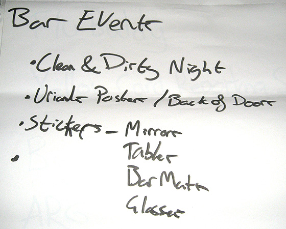
On Wednesday, the day before the presentation, I began to write up a small booklet that held all of our research so far, a brief overview of the above ideas and anything else that we felt was necessary to present to the committee. This included the provision to have some sort of themed student union bar night where students would be able to buy cheaper drinks if they came in clean or dirty fancy dress i.e. french maid for clean or binman or dirty.

On Thursday, all four of us attended a committee meeting at 8:30am. Most of the meeting was taken up by the committes responsibilities to the university but an hour into the meeting, we had a chance to discuss our ideas.
Jayne Dodgson introduced the four of us to the rest of the committee and I handed out the booklet that I had produced with the ideas and research in, guiding them through each idea and their merits. Each idea got a few laughs and approval, with plenty of comments on each idea, which was great. It felt good to have come up with ideas that were being received well by those who would be approving it.
After discussing each idea, I asked if they could make a decision on which idea they wanted to move forward with and again, we went through the merits and disadvantages of each one. The Quarantine idea was rejected because although it was a great way to get students involved, the committee were fearful that it was too much work to take on within the timeframe. Additionally, they thought that the information may be too specific and at the time, thought that Swine Flu may change into something different in the coming months and anything that we filmed or designed might be too specific for the here and now.
The Pick-up Lines idea was received really well for its cheekyness, but partially rejected because the committee thought it may be a bit too risky, especially in the first few weeks of the new term. While the committee liked the idea, they were concerned that it might promote the wrong message about the university.
And so the strongest idea, Touching Man, was settled on. From the very start, we had been really focused on this idea. It just seemed to shout out to us and so we were quite pleased that it had been chosen by the committee. We left in a positive mood and spent the rest of the day looking around the various campuses to see if there was anything special we could do for the project in certain places.
Designing Touching Man
The next day, we set to work on coming up with ideas for what Touching Man should look like. It was very important that we get this right, because the character would literally be the face of the campaign. His appearance would tie all of the campaign’s assets together.
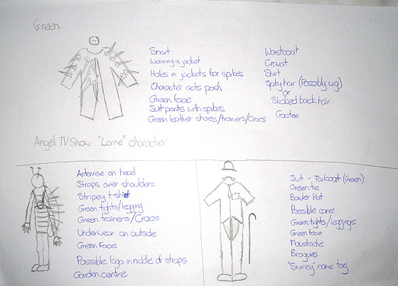
I already had an idea of what I wanted him to look like and the main thing was green. Green face, green clothes. Green. For me, there is no colour that better communicates “virus” than green. However, there were also other ideas to consider. These included Will’s idea of a character similar in appearance to the Angel character Lorne. A classy, well dressed character marred by green spikes coming through his suit and with a green face to go with them.
My idea built upon the use of spikes, but gave the character more of a bug-like personality, with a spike-covered shell on his back, stripy green top, green underwear on top of his skinny jeans and some antennae to go with it.
The third idea was courtesy of Hannah, who wanted him to be a very classy gentleman, wearing a tuxedo and bowler hat and a handlebar moustache.

The importance of green was emphasised by Will’s idea and my own, while the spikes in both of our ideas related back to what a Swine Flu molecule looks like. Because we didn’t have much of a budget to actually buy different costume parts, we decided that my idea was the easiest to accquire and still stay under budget.
And so by the end of the full first week of the project, we had now gotten to the stage where we had picked our campaign and how Touching Man should look. It had been a slow week getting to this stage, but now that were all focused on one idea, we could start to flesh out what we would be doing for it. Touching Man was taking shape.
In the next entry: Developing storyboards for a range of videos, a visit by the Archbishop of York and a trip to…a gardening store.
