How to put your customers off

expressperts

krazypizza
Would you order pizza from this guy?

In my last post about fast food leaflets, I wrote about how clarity of information is key to getting as much business from your potential customers as possible. This post is about how to turn them off.

Last week, I recieved this leaflet through my door and it certainly stood out from the usual fast food leaflets I recieve. Would you really be attracted to food with spiral eyes and a mouth, serving what appears to be a slice of himself to you? I find that quite off putting. Disturbing, even.

And then there’s that header. “The pizza delivery expressperts”. Perhaps it’s just me, but trying to combine two words like that while worth a try at the design stage, is certainly not good enough to put on the front of a leaflet, regardless of what it’s for. You do have to wonder who designs these things and, more importantly, why the client signs off on it.

To their credit, “Krazy Pizza” have one of the clearer menu designs inside, but the leaflet’s cover would put me off. It just doesn’t look healthy at all, does it?

My design books

books

For the most part, I actually prefer to find my design inspiration online, simply because there’s so much of it about. However, there are some times when you need not only high quality images to really see the detail in something, but also, a range of pieces that a professional has chosen, rather than a small collection that a blogger may have chosen to write about – which is what I’m about to do! My book collection is very small, but those that I do have are not only informative, but also a great resource for various projects. I’d recommend these books to anyone interested in design. All links will take you to Amazon, simply because Amazon have all of the books on this list.

areaArea

Author: Anthon Beeke, Nick Bell, Ken Cato
Publisher: Phaidon Press

Area is a great book for when you’re looking for some inspiration from all over the world. Area doesn’t just focus on one country or culture, but an incredible amount of them, sourcing images from Tehran and Berlin to Amsterdam and London and back. Curators of the book include the likes of Stefen Sagmeister. What’s really nice about this book is that because it’s physically big (measuring in at 29x25cm), you have a great view of some of the most detailed work. It’s hard to call this book a ‘coffee table’ book simply because it’s so big (445 pages) but there is a lack of detailed information. The book chooses instead to dedicate its space to the visuals. So, if your aim is to find out the reasoning behind something, then this book isn’t for you, but if it’s pure inspiration and enjoyment of graphic design, then by all means, consider Area as your next design book purchase.

visualresearchVisual Research

Author: Ian Noble, Russell Bestley
Publisher: AVA

Considering this is a list of books that I own and wish to write about, this one is one that I regret purchasing. I don’t find it particularly useful because it’s written with the graphically and technically minded in mind. I suppose you could argue that since I am a graphic designer, I should enjoy and understand this book, but it’s just not enjoyable to read. The book is made even worse by the strange layout of it, shifting from serif text to sans serif throughout. In some cases, some of the informative text looks more like a piece of artwork. This is fine, but for a book that’s meant to be informative, you do tend to skip over some of the visuals and therefore miss out on the information you’re search for. So, while I do own this book, my advice is to avoid it.

asmileinthemindA Smile in the Mind

Author: Beryl McAlhone, David Stuart
Publisher: Phaidon

If there’s one book on this list that you’ve probably heard of and/or seen in your design library, it’s probably this one. The book’s opening chapter begins:

Thank goodness the brain is designed to be uncreative. With eleven items of clothing to put on there would be 39,916,800 ways of getting dressed. The brain is designed to make patterns, to use them and to stick to them.

With an opening like that, it’s easy to tell that this book is all about being creative, but creative in a way in which makes people smile. Creative in a way in which people ‘get’ it. Where the previous book fails in explaining this smile in the mind, this book succeeds. Not only does it offer a good in-depth overview of the methods and executions it discusses, it also gives pages and pages of great examples. As many other designers would agree, A Smile in the Mind is a book which should be on any designer’s shelf.

creativeadvertisingCreative Advertising

Author: Mario Pricken
Publisher: Thames & Hudson

Where the previous book deals with how other people have created fantastic and creative pieces of work, Creative Advertising shows how you can do it yourself, giving numerous small tasks you can set yourself. This book doesn’t deal with the technical aspects of things like colour and composition, but rather the methods in which you get to that stage, asking questions such as “What if the product could defy gravity?”, “What if the product could make animals talk?” and other such questions to spark an idea. This is definitely a book which needs more than just a passing glance in order to get the most from it. However, if you do decide to spend time not only reading this book, but following its tasks, it’ll certainly be worth the price you paid for it.

The Creative Handbook

Publisher: Creative Review

This isn’t actually a book you’ll find on Amazon, but rather one which strangely came free with my subscription to Creative Review. It’s not even really a book. It’s more a Yellow Pages for creatives. An entire book dedicated to finding top design agencies, photography studios and other creative outlets. What is really interesting about this book is the way in which these companies choose to advertise, showing some of their best work, some of which is stunning. The Creative Handbook is published yearly and so each handbook is different, but if you happen to come across one, it’s worth keeping a hold of, especially if like me you’re interesting in applying to a few agencies.

1000graphicelements 1000 Graphic Elements

Author: W. Harvey
Publisher: Rockport

Out of all of the books I own, this is definitely my favourite. This book has an incredible amount of creative bindings, finishes, packagings and other truly impressive ways of presenting an idea. Although there’s no detailed information on any of the executions, the photos are so perfectly shot that it’s hard not to instantly understand what’s going on. The book is separated into sections including Printing, Manipulated Surfaces and Unique Materials. Each section has a wide range of agency work, with accreditation at the back. If ever you’re in the need of an original way of presenting something, this is absolutely the book for you. I can’t recommend it enough.

howtobeagraphicdesigner How to be a Graphic Designer Without Losing Your Soul

Author: Adrian Shaughnessy
Publisher: Princeton Architectural Press

This is another book that should be on the shelves of every graphic designer. The advice given is advice which you would never get from a University tutor (and some could argue that this is what University should be about – Getting real advice!), but rather, a honest look at the industry of graphic design and what you’re up against if you choose to be a part of it. Shaugnessy does an excellent job of explaining things like how to find a job, working freelance and self promotion. His words are not filled with technical jargon, but simply written from his perspective, along with contributions from the likes of Neville Brody scattered throughout. The book itself is beautifully presented with plenty of small footnotes and afterthoughts which are just as interesting as the main articles themselves. This is definitely a book you should own.

79shortessaysSeventy-Nine Short Essays on Design

Author: Michael Bierut
Publisher: Princeton Architectural Press

I’ll be honest and say that I’ve still not had a chance to completely read through this book, but it’s a book that you don’t need to read completely in order to enjoy it. This book become part of my collection after Ben Terrett suggested it on his blog. As the title suggests, this book is made up of small, easy to read essays about various elements of design. While the author of the book may be Michael Beirut, there are contributions from a huge number of designers and all of the articles are worth reading. What’s also really nice is that each individual essay is set in a different typeface, making the essay stand out more. What’s more is that information on how it’s been set out can be found at the back, along with the author of each essay. The size of book makes for easy reading when you’re not busy at the computer, with its small size and hardback cover. A really nice book and one which I still need to read thoroughly!

itsnothowgoodyouareIt’s Not How Good You Are, It’s How Good You Want To Be

Author: Paul Arden
Publisher: Phaidon

As with the previous book, I haven’t had a chance to read all the way through this because it was only given to me recently by Thoughtful. However, after flicking through it, it’s going to be a very easy read as there’s less than a paragraph of text on most of the page. That’s not to say that the paragraph is undeserving of being read, however. In most cases, what I’ve read so far is quite interesting. The book has a fairly light-hearted feel to it, with lots of humorous lines in it. This kind of book can be read in less than a few hours, but the advice contained within it will undoubtedly stick in your head for many months to come. It’s definitely a worthwhile purchase and one which is less than £5.

So, there’s my list of books that currently adorn my shelf. As I said at the beginning of this post, it’s not a huge collection, but I consider these books to be worthwhile purchases and ones which far outweigh the cost of buying them. Many people could argue that the art of a printed book is declining, but there’s something about a physical book that can never be replicated by viewing it online. Sometimes, it’s all about holding it and turning pages. It’s that tactile action that makes you enjoy the book even more and perhaps even help you remember what you read. I would recommend any of these books to anyone interested in design and in the coming years, I have no doubt that my collection will grow much larger than it is now. At that point, my next book list post may be considerably longer!


How to confuse your customers

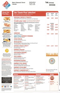
Dominos pizza menu is a little confusing

Do me a favour: Click on the image on the left of this post and tell me the price of a large Mexican Hot pizza from Dominos and reply to this post with the price.

Why am I asking such a strange question? Because I for one have no idea how much it costs and I’ve looked at the menu for a good ten minutes since recieving it through through my letterbox. I know how much an Original Cheese & Tomato pizza costs and I know how much it would be to create my own pizza. I also know how much a Mighty Meaty pizza costs, just one item down below Mexican Hot, but I’ve no idea how much the Mexican Hot pizza and the other pizzas on there cost. Why? Because there’s no easily identifiable price for them. I’m hoping that I’m not going crazy and you’re just as confused as I am with this menu.

I find it strange that such a large and popular company would not go to every effort to make sure that I understand how much something costs before ordering it. It wouldn’t be hard to add the prices for each separate pizza and yet they’ve been omitted, creating a level of confusion that shouldn’t be there.

If a customer doesn’t know the price of something, it makes the customer lack confidence and that will reduce the chance of them calling up and finding out over the phone. It’s an unnecessary barrier and one which could potentially lose you a customer because such a customer may simply decide to either go with a rival company or decide against purchasing anything at all.

In order to capitalise on your market share, every effort should be made to make buying one of your products as easy as possible for the customer. If it’s not easy, your customers will get turned off and look elsewhere.

Do let me know if I’m wrong on this.

A day at the URBIS

img_4937
The URBIS looks great from the outside

On Wednesday, I went to the URBIS in Manchester. It’s a great looking building.

There were two reasons for my trip to the URBIS. Firstly was the D&AD exhibition of all of their annuals since its beginnings in the 1960s. It was interesting seeing how it had envolved over the last five decades but because the annuals were encased in glass and only one page displayed, the exhibition felt a little…stunted. Here was an opportunity to display 50 years of work, but it had been reduced down to just a few examples. The others from my class who had also come to see the exhibition felt the same way, asking “Is this it?”. It felt like a bit of a let down.

However, more importantly than the exhibition and the main reason I had decided to come was because I had been selected for a portfolio surgery. A portfolio surgery, as I found out a few weeks ago, was a chance to spend 20 minutes with someone from the design industry and simply get a chance to talk about your work and invite comments on it. An opportunity that I didn’t want to miss out on. After signing up for one, I was happy when I recieved an email saying that I had been chosen to have my work looked at by a company called Thoughtful.

I hadn’t heard of Thoughtful before so I spent some time doing some research into them, getting to know them via their website and their blog. I think it’s so important for someone like a design agency to have their own blog because it makes the company so much more accessible to the public and those people who may potentially hire them. Thoughtful’s posts were interesting to read and I left a number of comments to which I recieved a nice email from Stuart Price, one of the top guys at Thoughtful saying thank you for the comments.

Putting my portfolio together prior to the surgery was a relatively easy task as I had already done it a few months ago for Univeristy. However, I had been wondering how to organise it so that it was in an order that would create the best impact. In total, I had 18 pieces in my portfolio, but since I only had a maximum of 20 minutes with the guys from Thoughtful, I knew that I had to trim that down. I managed to get it down to 15 instead, with more emphasis on my better projects, allowing me to spend more time talking about them and less time about some weaker projects.

CD packaging
CD packaging

In addition to my work, I wanted to leave Thoughtful with a copy of my work. However, just handing over a CD seemed a bit of a missed opportunity and so I created some simple packaging for it, along with including my business card and some of my stickers. It wasn’t much, but it was enough to show that I already had my own brand.

Lots of goodies inside

The interviews were being held in a large room, full of other design agencies. This included elmwood and The Chase. I could see into the room through the full length glass windows and managed to spot the Thoughtful team. It’s quite strange recognising someone you’ve never actually met before. I also noticed that Thoughtful had chosen to bring some students along with them who they were currently working with as placements. I think it’s such a great idea to give them a chance to see so many people’s work.

Just before my interview, there was a talk from Ben Casey from The Chase about the D&AD exhibition. While it was very interesting to listen to him, as said before, there’s only so much you can say about such a small exhibition. Plus, I had to leave half way through because it was time for my interview.

I have to admit that I was a little nervous about the interview. I suppose I was treating it like a job interview in some respects. I’d shown my portfolio to other people before so it wasn’t the first time I’d done this, but every time is always different.

I sat down and Chris Jeffreys introduced himself to me, one of the guys from Thoughtful. He asked me if I minded if the three students sat in and looked through my work and I said I didn’t mind at all. It was quite interesting showing my work to four people instead of one.

As I began talking about my first piece of work – my Oxfam posters – Chris interrupted me saying “I’m sure I’ve seen these before”. “You have”, I said, “On my website”. “Oh, you’re Neil!”, he said, referring to the fact that I had been commenting on their blog. It felt quite nice being known without having met Thoughtful and even nicer that they had taken the time to look through my work on my website.

Chris critiqued my work for 20 mintues, saying what was good and what was bad. He noted that one of the things that I could possibly add to the portfolio was the actual artefacts that I had produced, such as my 10×10 book. I very much agree with that and next time I have an interview will definitely bring it with me.
The 20 minutes flew over so quickly that it felt like I had only been sitting there for a few seconds. I think I was right to reduce the amount of work in my portfolio and ideally, perhaps should have reduced it even further because it did feel like I was rushing towards the end to make sure I got through it all. I think next time, ideally, I should have about 10 pieces of work instead of 15.

A Thoughtful gift
A Thoughtful gift

At the end of the critique, I thanked the four of them for their time and Chris gave me a book called “It’s Not How Good You Are, It’s How Good You Want To Be“. I think it’s such a nice gesture to offer everyone a free book, especially one which had obviously been thoughtfully selected. In return, I gave them my CD with my work on it, shook the hands of all four of them and said goodbye. My only regret is not being able to spend more time talking to them.

Thoughtful seem like, well, a thoughtful design agency to me. They come across as a company who are very easy to approach and I think that was reflected in my critique with them. I’ll be continuing to read their blog and see what else they get up to this year. Having the opportunity to discuss my work with them was a really useful experience and one which I hope I have many more of.

The importance of a source file

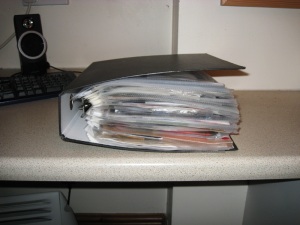
My source file
My source file

A source file can be incredibly useful in finding new ways to progress with an idea. A source file allows you to see what’s worked in the past and how you can make it even better. It gives you ideas on how to progress with your idea without treading on the ideas of others.

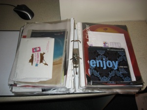
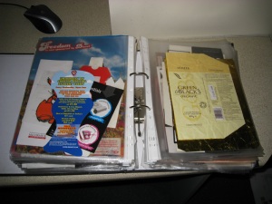
My source file has been accumulating since 2002 and as you can see, it’s gotten quite big. There’s all sorts in it. Magazine adverts, packaging, tickets, leaflets. Everything. It’s all useful for design research.

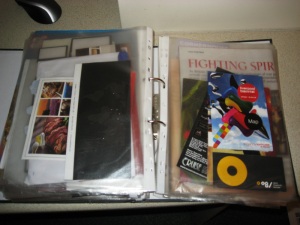
Tickets, flyers and lots more

You’ll find that some of the best design ideas come from the more obscure pieces of promotional material. Don’t just collect posters, but things like ticket stubs and magazine covers too. Check out the D&AD ticket. Very simple, but very eye catching.

If you’re lucky enough to know or be a student, then you’ll undoubtedly get countless leaflets and flyers posted through your door pretty much every day of the week. Keep them. Well, keep the good ones, that is. Sometimes even the bad flyers offer you good ideas on how to improve them and/or your own work.

They won't miss one menu

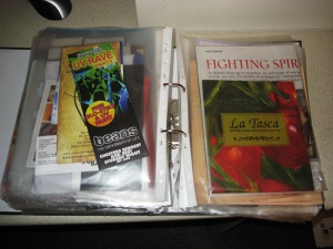
Not that I can be responsible if you get caught of course, but if there’s something particularly interesting in a shop or a restaurant that you think would be great to keep, take it. Now I’m not condoning shoplifting of course, but La Tasca certainly aren’t going to miss a menu, as seen on the left. I picked this up because it’s a great example of how a menu should be designed. You should have a look if you get a chance.

Some great examples of packaging

Another example of something you should have in a source file is packaging. A lot of times, companies will send you stuff through the post that’s more than just a letter. They do this to grab your attention. And if you take the time to open it and see what it is, then it’s done its job of getting you to notice it. And if something does that, keep it. Learn from it. Use it in your next project.

Chocolate - A good source of creativity

Finally, take a look at the packaging that your shopping comes in. From cereal boxes to beans to chocolate to drinks, it’s all relevant. As before, if it makes you pick it up, then it’s done its job and you can learn from it to help you do the same with your project. In particular, you’ll find that the way chocolate is packaged is quite interesting. Chocolate is always seen as a luxury item and you’ll find that it’s always packaged to reflect that, with gold/silver leaf and rich colours. If nothing else, these types of packaging offer you a chance to see which materials would look good on your products and posters.

So, if you haven’t already got one, consider starting a source file. It’ll help you considerably when you come to thinking about your next project. If you do have a source file, I’d love to see yours and compare. Send me a link and I’ll check it out.