Why kerning is important

There’s a new film coming out this July called 2012. The film itself looks like a carbon copy of The Day After Tomorrow, and that might be because both films are directed by the same director. But that’s not why I’m writing about 2012.

After viewing the trailer, the title of the film, ‘2012’ came into view and the very first thing I noticed about it was that it looked…odd. It didn’t read ‘2012’, but moreso ‘2 012’. Why? Because of kerning. So what’s kerning? Paraphrased from Wikipedia:

In typography, kerning is the process of adjusting letter spacing in a proportional font. In a well-kerned font, the two-dimensional blank spaces between each pair of letters all have similar area.

So, in other words, it makes typography look more readable.

Before kerning and after kerning

Many fonts unfortunately have bad kerning. With some font creation applications, you can kern your type automatically, but this gives limited results. And of course some choose not to kern at all, leaving you with a font that may have beautiful letterforms, but when put together, terrible sentences. You have to wonder why the designers of the 2012 typography didn’t manually kern 2012 so it reads better. It’d be quite interesting to speak to the designer to see why they missed out such a crucial stage of type design, as I believe it’s clear to most people that the space between the two and the zero is far too much. To the right is a before and after of what the typography should look like. This took me 60 seconds to improve, but looks considerably better.

It’s not hard to do and considering the typography will be used in conjunction with a high-end publicity campaign, it pays to get it right.

A redesign of the redesign

As said in a previous post, I didn’t think my redesign of my website was good enough to display my work. With that in mind, I decided to redesign again and I’ve just completed and uploaded it. You can see it at www.theworkof.co.uk.

Although it’s not perfect, I do believe it satisfies my needs a little better and I’m much more comfortable with it than the previous design. There are a few key reasons why I’m happier with this design. You might want to consider these reasons if you’re designing your own site, too.

Firstly, it catches your attention better. This is because the logo is now at the top of the page, with a bright header image that directly relates to the logo and indeed why the logo looks like it does. Also, this design looks much more like it relates to my business cards.

The header image is linked to my biography, which I believe to be an important part of why a potential client should choose me over someone else. It’s not an extensive biography and it’s subject to change, but I do believe that this works better than what I had before, which was far too long. One thing that is currently missing from my bio page is my CV, which I intend to add shortly.

It’s now easy to see when I’ve updated the site with new work, as new work will appear on the main page of the site. While I will of course be producing work all of the time, it will be at a slow and steady rate, rather than churning out something new every day, which is why there is only need for one new artwork space on the front page. It allows me to rotate new artwork when I want.

My blog is now directly accessible from the front page and much more visible. I want this blog to be quite an important part of my site as this is where you can find all of my behind the scenes writing and images, such as developmental work.

I think it’s important to show potential clients what I’m looking at to get my inspiration so I’ve added a third section called “Elsewhere”, which gives a short list of links to articles which I’ve been reading recently around the web.

The way in which I’ve designed this site allows me to use the full width and height of the layout so that any work can fill it. I think this makes the work look larger and allows the viewer to be enveloped in it. I’ve also spread the work out onto multiple pages, rather than making the user scroll down the page. Again, this is so that the user can be fully enveloped in one piece of work or a part of it.

As I said to begin with, I’m much happier with this design although of course as a designer, I’ll never be 100% happy with it and it will most likely evolve over time to further suit my needs but for now, it’s something that I’m happy showing potential clients.

I’d really love your thoughts on it so please feel free to either email me at neil @ theworkof.co.uk or comment on this post. Thank you.

The power of advertising

This is an article I originally wrote January 16th, 2006, but I think it’s inclusion in this blog is quite relevant.

Today I want to talk about TV adverts. While most people probably don’t pay that much attention to them, they are the most important thing you’ll ever see on TV aside from the programs themselves (although some would argue that). They’re big business and businesses will do anything to make sure their advert and their product is directly in front of you and that you’re taking note.

I’m going to talk about three ads from three different companies; Honda, Audi and Sony. These ads in particular have made me sit up and pay attention and therefore remember what the advert and brand was. Most definitely a good thing for these companies.

Honda

“The Power of Dreams” is Honda’s slogan and with the kind of adverts that they’ve been producing for the last few years (or rather Wieden+Kennedy, the creative agency behind them), they really stand out.

Mention “Cog ad” to anyone who watches TV or uses the Internet and I’m sure they’ll know instantly what ad you mean. Now one of the most famous adverts around the world (even though it only aired on TV in the UK) thanks to viral marketing, Honda has managed to create free advertising for itself, simply by creating a good advert – which it was going to do anyway. Honda had to pay a few million pounds to get this 2 minute long masterpiece created and then splash out on actually paying for it to air on TV. However, since the cog ad is now a worldwide success online, Honda have easily made up their money in free advertising. But anyway, it’s not the cog advert I want to talk about, it’s Honda’s latest offering.

When I first saw it, I was sitting on the floor, playing with my cat when I heard Garrison Keillor, the voice of Honda simply say “This is what it feels like to be a Honda”. I immediatly paid attention. See last paragraph for reasons why.

What follows is a two minute symphony of sounds created by a chorus of ‘singers’. For example, in one part of the advert, the singers tap on their teeth repeatedly to describe the tyres of Honda’s new Civic rolling over gravel with a depiction of a car actually doing it. There is no music, there is no narration, just these unusual – and yet familiar – sounds that the chorus of singers are making to imitate a car. I sat mesmerised, watching and listening happily for the two minutes that the advert was on and felt truly happy that I’d had the opportunity to watch it because it was so impressive in such a subtle way.

And that’s how adverts should be.

Of course, Honda, being the kind people they are, are offering everyone the chance to watch this advert over at their site, so please do go and watch it. You won’t be disappointed.

Audi

If Honda relies on simplicity and subtlety, Audi is the opposite with it’s recent “in your face” closeups of an Audi driving towards the viewer and stopping just a few metres away.

This ad caught my attention not for the visuals, but for the choice of sounds the people at Bartle Bogle Hagerty (the creative agency behind the ad) had chosen; Just a few simple notes played on a violin was all it took to get my attention. At the time, I was in the kitchen, but the arrangement of the notes was enough to make me come into the living room and see what it was.

My first thought was that it reminded me of Lord of the Rings: The Two Towers, when Shelob, the giant spider stalks Frodo. It has exactly the same kind of atmosphere only instead of her prey being anything with two legs, it is instead four wheels, as you see cars hanging from the ceiling with masses of cobwebs. While the advert only lasts for around 30 seconds, the atmosphere has been created well enough that you can immerse yourself in what could easily be a scene straight out of a movie and to that end, you even get the aforementioned giant spider scuttling towards you, only to change into an Audi RS4 Quattro by the time it’s up close and personal. It’s impressive. In addition, the words “Vorsprung Durch Technik” are spelt out in cobwebs at the very end of the advert in such a way that it adds a second punch to the minor shock you’ve just gotten from seeing a giant spider coming towards you.

It’s a very well made piece of advertising. If you’d like to view it, visit4info.com has a copy of it.

Sony

Lastly, but my no means least is Sony’s impressive advert for Bravia, the new LCD TV that’s “like no other”, which takes a leaf out of Honda’s book and goes for the subtle approach.

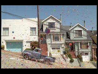
Launching 250,000 bouncing balls down a street in L.A. has to be one of the most ludicrous ideas ever. To actually watch a quarter of a million bouncing balls bouncing down a street is amazing.

Using a piece of beautiful music by José Gonzaléz entitled “Heartbeats”, Fallon London (The creative agency behind the ad) have created something really special. There really is colour “like no other” – at least in this advert. It’s truly mesmerising seeing a multicoloured tidal wave of balls bouncing down a street. Like the two adverts I’ve mentioned already, I instantly felt that I had been shown something well worth watching and something worth watching more than once. Sony Bravia as a product may or may not be any good, but the quality of this advert instantly makes it a lot more famous that it would probably ever be without it. Personally, I feel that Sony aren’t particularly famous when it comes to creating memorable adverts, but they’ve really achieved it with this one.

Furthermore, unlike most impressive adverts that have sites attached to them, Sony’s bravia-advert.com [link no longer works] has an adequate amount of information relating to the advert itself, including the edited version of it, the uncut version of it (both available in HD format too) and even behind the scenes clips and photos. They’ve even bothered to offer some high resolution wallpapers which impressed me, along with a Flickr album. By far the best website I’ve seen regarding an advert for a while.

Three adverts, all different, but all have something in common – they kept me watching. And if they keep you watching and you actually enjoy watching them, then at what point does an advert become more like a program? That is to say, if adverts can look this good and some adverts can last for two or three minutes, what makes a program more important than an advert?

If an advert is produced so well, who’s to say that you can’t sit down in front of the TV specifically to watch some great ads? You get to be entertained for a few minutes and the companies get their marketing. I’d say that was a fair deal and I hope that in the future, more companies begin to see that investing heavily in their advertising to make it entertaining rather than simply informative works so well.

When good isn’t good enough

Having launched my site at www.theworkof.co.uk, I find myself questioning its ability to display my artwork in the best possible way. I don’t believe that the site entices people to look closer at the work displayed on there because of its over-simplistic design.

There are reasons why it’s designed the way it is, however. The main reason is because my previous design was difficult for a potential client to use. It took four clicks to actually get to a piece of artwork, which is unacceptable. With this new design, it takes one.

Secondly, it’s as simple as it is so that it’s easy to update. I don’t claim to be a web design guru. I wouldn’t call myself a beginner at site design by any means, but I’m certainly not a professional web designer. My work is very much print based. I don’t really deal with design for web.

For these two reasons and a few others, I decided to go with this design. However, now that it’s launched and I’ve recieved feedback from people on how it looks, the majority of its has unfortunately been negative. That’s not to say people have been unkind about it, but simply expressed a dislike of it. The work itself, people have said is great, but that the site is doing me no favours.

Like most designers, nothing is ever and will never be good enough. It will always need tweaking. It will always need an extra hour, day or week spent on it. My site design does the job, but doesn’t do it well enough. To this end, I’m considering a further redesign in order to better display the work.

In the meantime, I do believe that it at least gives me a chance to display my portfolio is a manner that is better than my previous design.

Unfortunately, because I have a lot of University comittments, the time I can spend on my site is quite small and so any further design work will be slow. However, since my website is the most important way of people finding me, I do believe it should be one of my priorities. I have until January 5th until I’m back at University. In an ideal world, I’d love to have it up and running by then, so that I can further promote it to potential clients and design agencies.

If you have any comments on the site, I’d love to hear them.